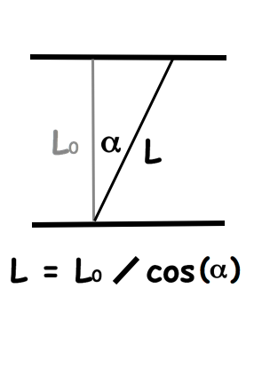
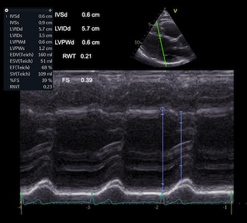
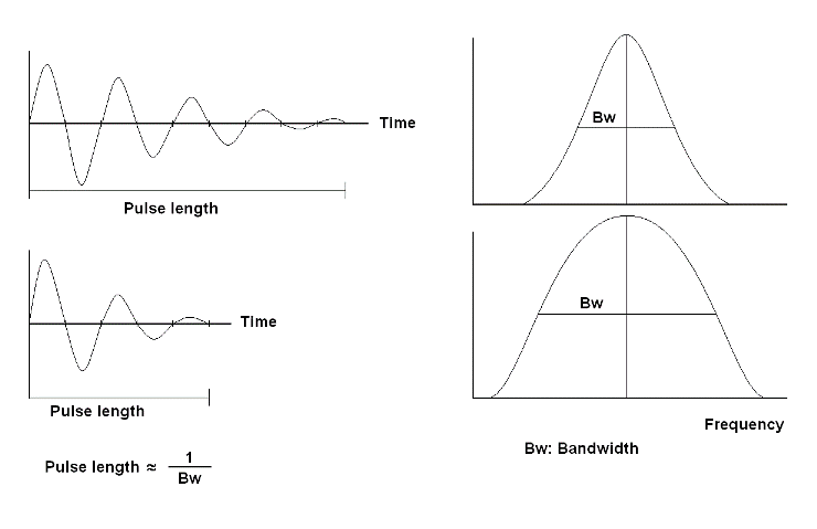
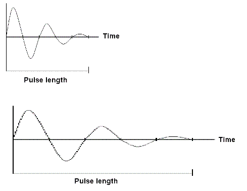
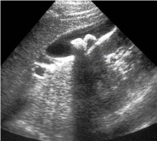
Interestingly, the M-mode values of HUNT3 showed a
substantial higher wall thickening in the PW than in the
septum, while the 2D measurements in HUNT 4 did not reproduce
this finding. This effect is probably due to the specific
vulnerability of M-mode to the effects of the long axis
shortening, making the M-mode cress different parts of the LV
in systole and diastole. The configuration of the posterior
wall in then base may thus induce a statistical bias towards
over estimation of wall thickness as shown below.
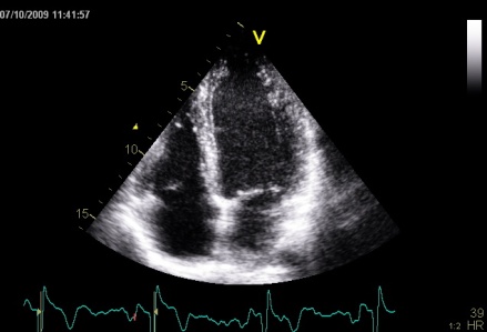
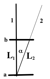
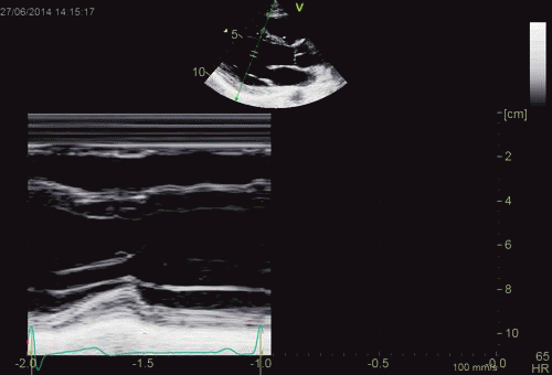
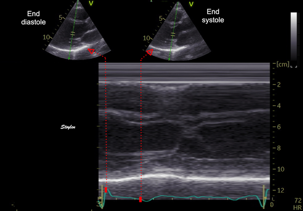
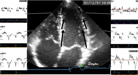
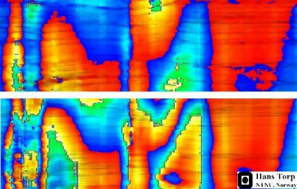
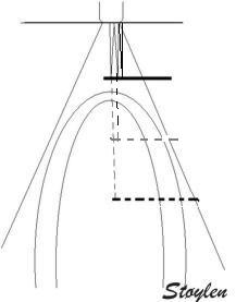
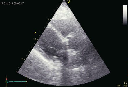
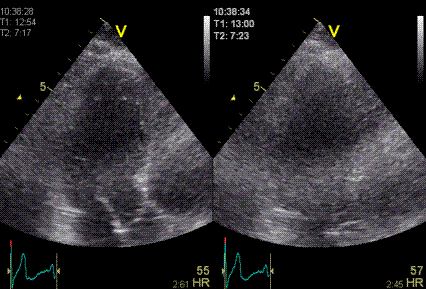
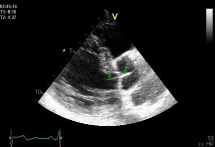
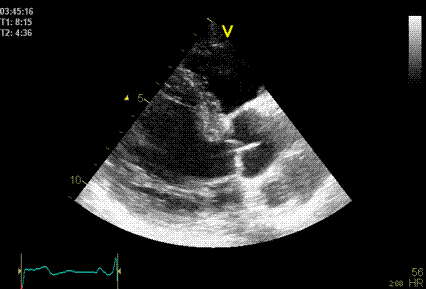
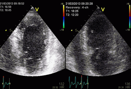
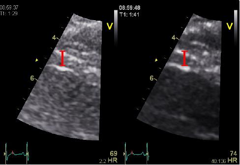
Images from different parts of the heart
cycle, showing that the line crosses different parts of the
LV in end diastole and end systole. As the end systolic
frame has moved the base of the heart further towards the
apex, and the posterior wall thickens towards the mitral
annulus, the motion induces an apperent over estimation of
end systolic thickness, which will be reflected in the
M-mode measurements:
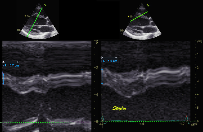
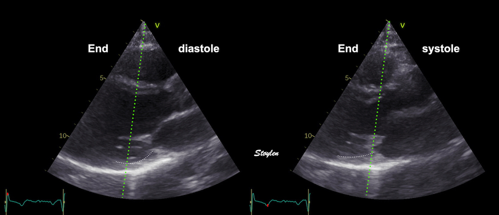
The apparent higher thickening of the
posterior LV, may thus be due to the increased thickness of
the posterior wall moving into the M-mode line due to the
longitudinal motion of the basal parts of the heart.
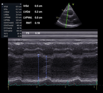
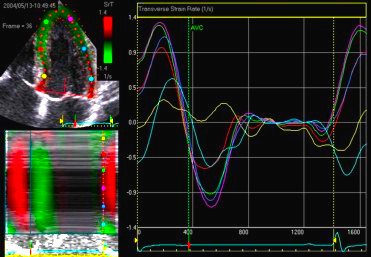
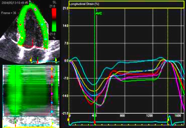
Comparing with longitudinal
deformation of the two walls, we found in HUNT3 that
MAPSE was about 14% higher in the posterior wall than the
anteroseptum, but the posterior wall was also around 10%
longer than the anteroseptum (156).
Thus, the relative shortening (longitudinal wall strain) in
HUNT 3 was 16.6% in the anteroseptum, vs 16.5% by segmental
strain, and 14.7% vs 15.5% (relative difference 5%)
by normalised MAPSE.
Thus, as longitudinal shortening and transverse thickening are
interrelated as shown above, similar relative longitudinal
shortenings between the walls, also indicates similar wall
thickenings. Thus, the physiology weighs in favor of HUNT4 in
this case, while the longitudinal and transmural deformation
data in HUNT3 are somewhat inconsistent.
Beamforming
Again, modern technology now allows a much more complex
processing technology allows using input data in a way that
also improves the beamforming characteristics in processing,
as they are used for the generation of a picture. Thus the
simple principles of beamforming outlined here are an over
simplification compared to the most advanced high end
scanners.
It is important to realise that the last
couple of years has seen tremendous improvements in both
hardware (allowing a much higher data input to the
scanner as well as processing technology), and software
(allowing more data processing at higher speed).
It even allow using input data in a way that also
improves the beamforming characteristics in processing,
as they are used for the generation of a picture. Thus
the simple principles of beamforming and focussing
outlined here are an over simplification compared to the
most advanced high end scanners.
However, they will still serve to give an idea. And
simpler equipment still conform more closely to
the basic principles described here.
|
|
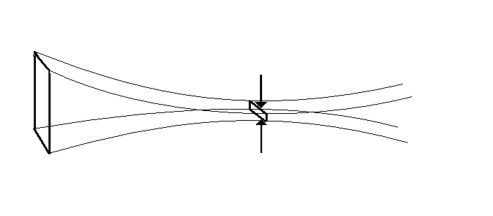
A. Mechanical
transducer. The sector is formed by rotating a single
transducer or array of transducers mechanically,
firing one pulse in each direction and then
waiting for the return pulse before rotating the
transducer one step. In this beam there is electronic
focusing as well, by an annular array.
|
B. Electronic
transducer in a phased array. By stimulating the
transducers in a rapid sequence , the ultrasound will
be sent out in an interference pattern. According to
Huygens principle, the wavefront will behave as a
single beam, thus the beam is formed by all
transducers in the array, and the direction is
determined by the time sequence of the pulses sent to
the array. Thus, the beam can be electronically
steeredand will then sweep stepwise over the sector in
the same way as the mechanical transducer in A,
sending a beam in one direction at a time.
|
Beam focusing:
 |
 |
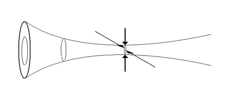
Dynamic focusing.
The same principle of phase steering can be applied to
make a concave wavefront, resulting in focusing
of the beam with its narrowest part a distance
from the probe. Combining the steering in B and
C will result in a focussed beam that sweeps across
the sector, as in the moving image above.
|
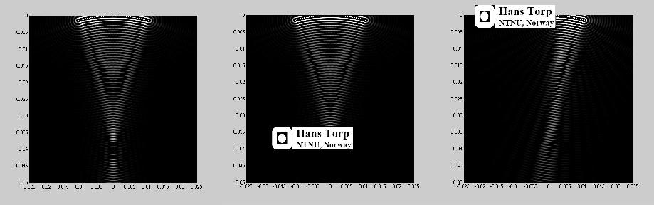
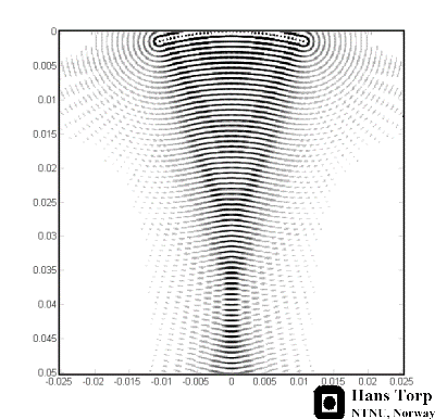
Resulting
Ultrasound beam as shown by a computer simulation,
focusing due to the concave wavefront created by the
dynamic focusing. The
wavelength is exaggerated for illustration purposes.
Image Courtesy of Hans Torp. |
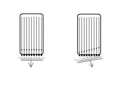
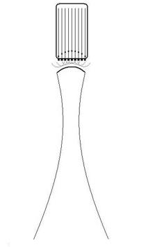
Focusing is illustrated above. In a mechanical probe, there may
be several transducers, arranged in a circular array, focusing
the beam in a manner analogous to that shown in fig. 7c. In a
circular array, however, the focusing can be done in all
directions transverse to the beam direction, i.e. in the imaging
plane and transverse to the plane, while a linear array can only
focus in one direction, in the imaging plane.
Annular focusing
in all directions both in plane and transverse to
the plane.
|
Linear focusing
in the imaging plane only.
|
A matrix array, can focus in both directions at the same plane.
The focusing increases the concentration of the energy at the
depths where the beam is focussed, so the energy in each part of
the tissue has to be calculated according to both wavelength,
transmission and focusing to ensure that the
absorbed
energy stays within safe limits.
Modern high end scanners has beams that are more focussed
along the whole length, allowing narrower and more lines in
the image, i.e. higher line density, and at the same time
allows higher frame rate due to among other things MLA related
image forming.
In order to increase aperture size, the beams should be less
focussed. In completely unfocussed beams, the wavefront is more
or less flat, and the beam has more or less parallel edges.
The advantage of this is:
- Transmit beams can be broad, but still have a good
resolution for multiple parallel receive beams (MLA).
This will increase frame rate, as there can be only one
broad transmit beam, instead of multiple scan lines. The
high frame rate allows multiple measures within a short time
frame.
- MLA will not result in angle
artefacts
- Depth penetration is better, as the beams do not diverge
by depth (below the focal point).
The main disadvantage is that with planar waves, the energy is
too low for second harmonic imaging, Thus, it cannot be used for
B-mode imaging, neither in 2D nor 3D. However, it can be used
for tissue Doppler, where
harmonic
imaging is unfeasible anyway, because of the
Nykvist
limit.
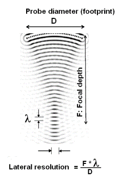
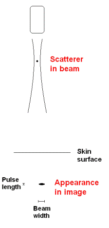
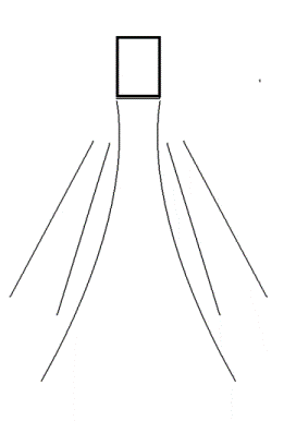
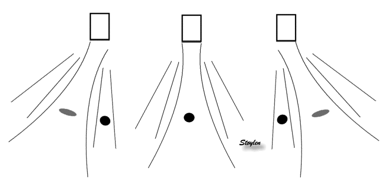
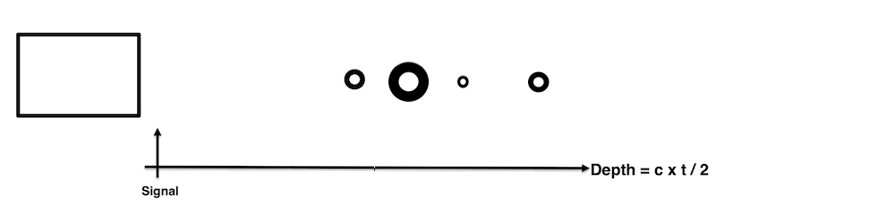
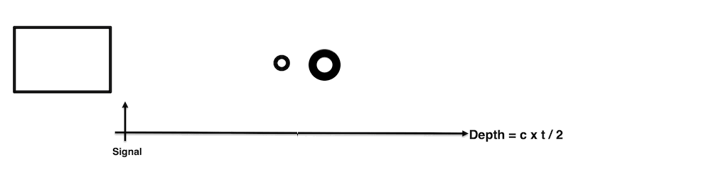
Lateral resolution
The apparent width of the scatterer in the image is more or less
given by the lateral resolution of the beam. (The thickness in
the axial direction is determined by the depth resolution, i.e.
the pulse length as discussed
above).
In addition, two echoes within one beam, will only be separated
by the difference in depth.
 |
 |
 |
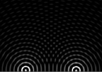
The lateral
resolution of a beam is dependent on the focal depth,
the wavelength and probe diameter (aperture) of
the ultrasound probe. A near shadow will reduce the
effective aperture, and thus the lateral resilution as
illustrated here.
(Reproduced from Hans Torp by permission) |
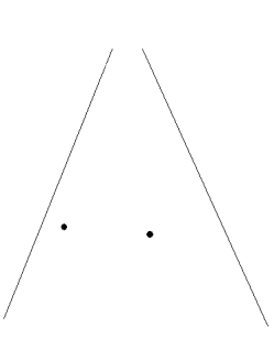
Two points in a
sector that is to be scanned. |
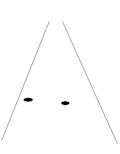
The ultrasound
scan will smear the points out according to the
lateral resolution in each beam. |
|
|

|
|
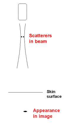
Thus a small scatterer
will appear to be "smeared out", and the apparent
size in the image is determined by the beam width
and pulse length. As the pulse length is
less than the beam width, the object will
be "smeared out" most in the lateral
direction.
|
Two scatterers at the
same depth, separated laterally by less than the
beam width, will appear as one.
|
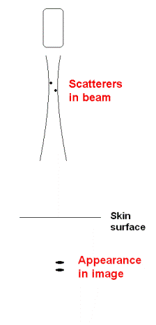
Two scatterers at different
depths will appear separate if separated by more
than the pulse length.
|
But, if separated both
laterally and in depth, they will appear as being in
the same line, if lateral separation is within the
beam.
|
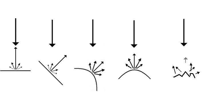
Artefacts
Reverberations:
Reverberations is defined as the sound remaing in a particular
space after the original sound pulse has passed.
Thus, a single echo is a reverberation (first order), and
multiple echoes will be higher order reverberations as
illustrated below.
the phenomenon that a sound pulse bounce back between different
structures before being reflected back to the observer. , while
in ultrasound iomages the term is usually restricted to
artefacts caused by the echo bouncing more times (higher order
reverberations) , creating false images
The phenomenon of thunder is a typical reverberation effect:
Reverberations: Simplified animation of thunder.
The sound of lightning is a short,
sharp crack.
The wavefront of that
sound (red) reaches the listener first, but the wavefront is
then reflected from different cloud surfaces with different
distance to the listener as secondary echoes, ( primary
reverberations; blue and green), an also tertiary echo
(Secondary reverberation; yellow) and even higher orders.
Thus, the crack is "smeared out" to a long lasting rumble.
In ultrasound imaging, actually the primary
echoes are first order reverberations. However, in
ultrasound images the term is usually restricted to
artefacts caused by the echo bouncing more times (higher
order reverberations) , creating false images as the partial
delay due to multiple reflections will be interpreted as
images at greater and different depths. One of the most
typical phenomenons are the stationary reverberations caused
by the bouncing of the pulse between a structure close to
the surface, and the probe surface:
Stationary
reverberations are caused by stationary structures, usually in
the chest wall, causing the ultrasound to bounce back and forth
between the skin and the structure, increasing the time before
the echo returns and giving rise to a false image of an apparent
stationary structure deeper down.
|
|
 |
|
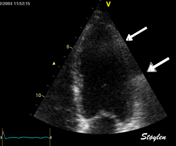
Top, a common reverberation in
the lateral wall, seen as a stationary echo
(arrows). Below, the principle shown
diagrammatically, a reflector causing the ultrasound
pulse to bounce, for each bounce back, the echo is
interpreted as a structure at a depth corresponding
to multiples of the original depth.
|
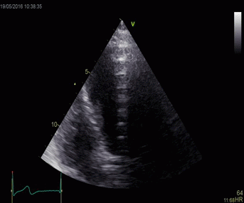
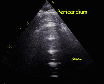
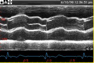
This is even more evident in
this image, showing multiple, stationary
reverberations from the apex. All the reverberations
have the same distance. In the blow up below, the
reverberation space can be seen to be a echolucent
space in front of the apical pericardium, and the
distance between the reverberations equals the
original distance between the probe and the
pericardium.
|
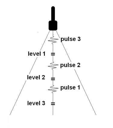
Reverberations needs not necessarily be totally stationary,
if the reflecting surface that gives rise to the echo moves,
the reverberations will move as well.
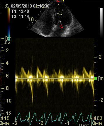
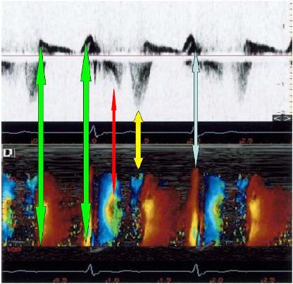
Reverberations
in colour Doppler
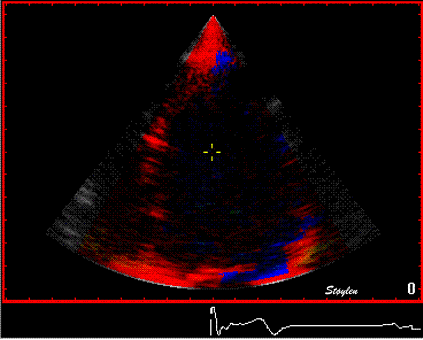
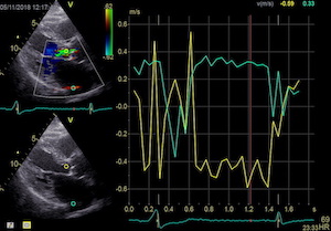
Reverberations may also occur in colour Doppler:
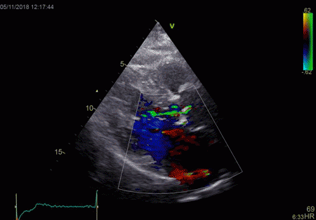
|
|
The red jet shown in the
atrium, is a reverberation originating from the
aortic regurgitation jet.
|
From the B-mode acquisition,
there can be seen a slight, possibly clutter line as
well, buty in this case the reverberation signal is
predominantly in the Doppler signal.
|
|
|
To
document that this is not a pathological jet, the
apical long axis and four-chamber views do not show
such a jet in the same location.
|
|
|
|
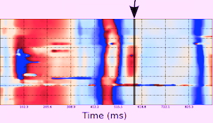
The simultaneous duration of
the two jets shown on the reconstructed M-mode also
confirms that this is a reflection, and not
something else (f.i. a venous signal or fistula)
|
The distance between the jets
is compatible with the reflecting layer being the
immovable structure outside the pericardium.
|
-and quantitative analysis
shows the reversal of the phase in the reflected
signal.
|
Ring down artefacts
The "ring down" phenomenon is a special instance of
reverberations in the form of a bright beam radiating out behind
a small echo lucent (often fluid filled, but may be fat) layer
behind a scatterer with high reflexivity. The source of the ring
down artefact is thus a small reverberating space
in front of
a powerful reflector, despite the fact that it is projected
behind it.
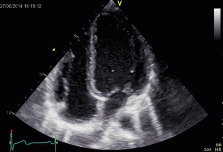 Ringdown artefacts in an echo from a healthy (and
young) person originating from the base of the left
ventricle and right atrium. As explained below, they most
probably originate from the pericardial space.
The persistence of the phenomenon through
the depth may partly be a function of the Time
Gain Compensation, and the fan like appearance of
course, is due to using a sector scanner.
Ringdown artefacts in an echo from a healthy (and
young) person originating from the base of the left
ventricle and right atrium. As explained below, they most
probably originate from the pericardial space.
The persistence of the phenomenon through
the depth may partly be a function of the Time
Gain Compensation, and the fan like appearance of
course, is due to using a sector scanner.
This artefact was originally described in relation to small gas
bubbles in the abdomen, and also to small cholesterol crystals
in the gall bladder. However, as seen above and below, small
structures in the pericardium as well as mechanical valve
components, may also give rise to this. The mechanism has been
proposed as being resonance, i.e. that the pulse hitting a small
gas bubble or cluster of bubbles may give rise to the bubbles
resonating, and thus emitting energy long after the original
pulse has been reflected. In the scanner this would be
interpreted to successive echoes in the same direction, but with
increasing depth, i.e. a bright ray. In echocardiography,
however, it is not uncommon, most often from the pericardium.
Normal subjects, of course, do not have air in the pericardium.
If present, they do not disappear with change of probe
frequency, excluding resonance as a mechanism:
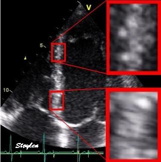
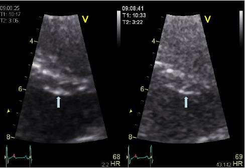
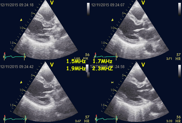 Ringdown artefacts from the pericardium. As seen by
this image, they are present with all probe transmission
frequencies, which would not be the case if this was due
to resonance.
Ringdown artefacts from the pericardium. As seen by
this image, they are present with all probe transmission
frequencies, which would not be the case if this was due
to resonance.
Resonance is basically related to a specific frequency, the
eigenfrequency of the source. Frequencies above that can
basically cause resonance, but mainly in the harmonic
frequencies, i.e. those that are one or more octaves (multiples
of the basic frequency) removed from the eigenfrequency. In the
example above, the artefact is present with frequencies that are
not multiples of each other, so resonance is ruled out.
Thus, the ring down artefact is a special instance of
reverberations,
where there are multiple reverberations within a short space as
illustrated in the diagram below:
Reverberations. In all cases,
reverberations are the result of the ultrasound pulse
bouncing back and forth between two layers, the low
reflecting space between them can be called the
"reverberation space". Here the probe surface is shown
in black, the reflector causing the reverberation in
dark grey, while the artefact echoes are shown in
lighter grey. The reverberation space in front of the
reflector is illustrated in light red.
- A: Classical reverberation where the echo
bounces between a reflector at some depth, and the
probe. This gives rise to the classical
reverberation, showing up as one or two stationary
shadows, as shown above.
- B: With a shorter reverberation distance,
the distance between the reverberations (artefact
shadows) decreases, and more false echoes with the
same distance between them arises, lying on a line.
- C: With a very short reverberation distance,
the reverberation echoes lies so close as to give
the impression of a beam.
- D: the reverberation space may be due to a
minimal layer of low reflecticvity (for
instance a minimal layer of pericardial fluid or
fat) in front of a dense structure (the
parietal pericardium)at some depth from the probe.
In that case, the beam will seem to originate here,
and not close to the probe.
It is clear that fluid filled layers in the
body may act as reverberation spaces, provided the structure
behind is sufficiently reflective. In the lungs, this
phenomenon is seen in connection with oedema in the
interlobular septa. The air space in the alveoli is almost
totally reflective. This is called comet tails.
Comet tails
The comet-tail artefact is used to describe the
ring down phenomenon doing utlrasound of the lungs, with a
cardiac probe (281).
This has been seen to be a marker of interstitial fluid in
the lungs (282),
i.e. edematous interstitial septa (equivalent to the
Kerley B-lines on X-ray), and has been seen to be quick
and reliable. The reverberations should then be within
the edematous interstitial septa, as air filled alveolar
clusters in front and behind would be strong reflectors,
causing the reverberation within a very short distance (283).
As penetration through the lung is poor, they have to
originate close to the lung surface:
 Lung ultrasoud showing comet tails from a
patient with heart failure. In this case theymove with
the lung during rspiration. The lung tissue can be
seen in the upper few centimeters, below that the
signal is totally attenuated, but the comet tails are
clearly visible. Image acquired with a hand held
ultrasound device. Image courtesy of Bjørn
Olav Haugen, NTNU
Lung ultrasoud showing comet tails from a
patient with heart failure. In this case theymove with
the lung during rspiration. The lung tissue can be
seen in the upper few centimeters, below that the
signal is totally attenuated, but the comet tails are
clearly visible. Image acquired with a hand held
ultrasound device. Image courtesy of Bjørn
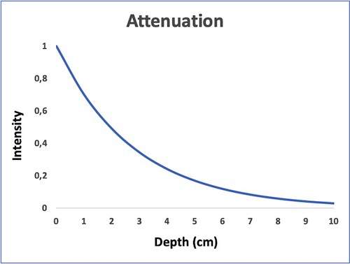
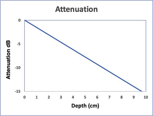
Olav Haugen, NTNU
As with calcification shadows, it is an example of an
artefact giving useful information.
The source of the ring down artefact is a
small reverberating space in front of a powerful
reflector, which means that the reflector may give rise to
an attenuation shadow as well. This is also shown up in the
cone behind the reflector, and this attenuation shadow
itself may act to increase the apparent gain of the ringdown
beam.
|
|
Ring
down echoes from the pericardium. They can be seen
as bright bands radiating
down, and the source seem to be real, as the
ring down beams are visible both in long and short
axis views from the same patient.
The reverberating space is probably the
pericardial space itself. The uneven
distribution of the ring down beams may be due to
the varying reflectivity due to different directions
of the surfaces relative to the transmitted beams.
|
|
|
Ring down beam
seen to originate from the apicolateral pericardium.
As with sidelobes, in this case the shadow is not
constant, probably due to the source moving
in and out of the plane.
|
Parasternal image from a
patient with a mechanic aortic valve, combining
shadows and ring down shadows. The thick
metal ring itself gives rise to an ordinary shadow
from the anterior part,, while the thin part of the
carbon fibre ring protruding out into the sinus
valsalvae, gives rise to a ring down beam. The
reverberating space may be the sinus in front of the
protruding carbon ring.
|
Discrete reverberations as shown above, is due to the
fact that the signal remains coherent, i.e. remains
reciognisable by the sacnner as a distinct echo.
Also, the echoes may be scattered in all directions, the
pulse may bounce in different directions (as in the thunder
animation above) before part of the reflected pulse reaches
the probe. Also The refelcted signal looses it's coherence.
This will not give a distinct echo like the one above, but
rather more diffuse, less dense shadows, as in the example
below:
|
 |
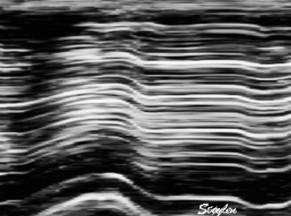
| Heavy
reverberation band across this long axis image. The
shadow is not ditinct, and thus far less coherent
than the examples above. |
Shadowy
reverberations covering the naterior wall in
this 2-chamber image. It is differentiated from
the drop out shown above,
as we can se a "fog" of structures covering the
anterior wall. The structures are stationary. On
the other hand, this is not distinct
reverberations shadows, but incoherent clutter.
|
Shadowy reverberations may seem of little importance, as the
B-mode often is faily well visualised anyway. This is
partluy due to the motion, and partly due to the second
harmonic mode, which reduces the amplitude of
reverberation noise, but only in the B-mode, as tissue
Doppler must be done in fundamental mode due to the Nykvist
limit.
The impact of reverberations on tissue Doppler are discussed
below,
on strain rate imaging by tissue Doppler in the measurements
section, and on speckle trackingin the measurements
section here
and here.
Stationary echoes and noise is also referred to as
"clutter". This noise may also result in a more random
pattern (shadowy reverberations), resulting in a more
blurred picture.
Side
Lobes
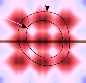
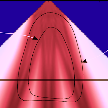
Each beam is not solely concentrated in the main beam as
illustrated above.
In addition, some of the energy is dispersed in side lobes
originating among other things from interference as
illustrated below.
|
 |
Simulated beam with
focusing, showing interference pattern dispersing
some of the beam to the sides. (image courtesy of
Hans Torp).
|
Side lobes from a
single focussed ultrasound beam. These side
lobes will also generate echoes from a scatterer
hit by the ultrasound energy in the side lobes,
i.e. outside the main beam. |
|
|
 |
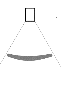 |
| As echoes from a
scatterer in the side lobe pathway is perceived
coming from the main beam, this will result in a
false echo, apparently from the main beam.. |
AS the beam with
side lobes sweeps back and forth a cross the sector,
each echo from the scatterer in both the main beam
and the side lobes will generate the false echo in
the position of the main beam. |
This again will
result in the echo being smeared out across the
sector, resulting in a smeared out echo across a
large part of the sector. |
 Patient with an aortic valve. The strong echo from
the metal in the ring creates sidelobes across most of the
sector. It can be seen to move awith the AV-plane motion
as expected.
Patient with an aortic valve. The strong echo from
the metal in the ring creates sidelobes across most of the
sector. It can be seen to move awith the AV-plane motion
as expected.
IN
most cases, the sidelobes originate form less
intense echoes, which gives smaller sidelobes, that
are more difficult to discern from real structures.
|
|
Side lobes
originating from the fusion line of the aortic
cusps, seen to extend into both the LV cavity
and the aortic root cavity (arrows).
|
As opposed to reverberations,
the side lobes moves with the structure, and
may change with time (in this case the echo
intensity of the fusion line decreases as the
valve opens, and thus the intensity of the
side lobes too) .
|
As opposed to reverberations, the side lobes will move
as well as increase and decrease in intensity in
parallel with the source of the echo as shown below.
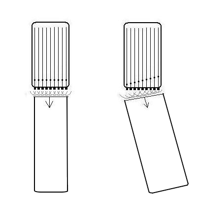
2-dimensional imaging:
A 2-dimensional image is built up by firing a beam vertically,
waiting for the return echoes, maintaining the information and
then firing a new line from a neighboring transducer along a
tambourine line in a sequence of B-mode lines. In a linear
array of ultrasound crystals, the electronic phased array shoot
parallel beams in sequence, creating a field that is as wide as
the probe length (footprint). A curvilinear array has a curved
surface, creating a field in the depth that is wider than the
footprint of the probe, making it possible to create a
smaller footprint for easier access through small windows. This
will result in a wider field in depth, but at the cost of
reduced lateral resolution as the scan lines diverge.
 |
 |
 |
|
| A pulse is sent
out, ultrasound is reflected, and the B-mode line is
built up from the reflected signals. |
|
Linear array.
|
Curvilinear array
|
The linear array gives a large probe surface (footprint) and
near field, and a narrow sector. A curvilinear array will also
give a large footprint and near field, but with a wide sector.
But in order to achieve a footprint sufficiently small
to get access to the heart between the ribs, and with a
sufficiently wide far field, the beams has to diverge from
virtually the same point. This means that the image has to be
generated by a single beam originating from the same point,
being deflected in different angles to build a sector image (cf.
figs. 6 and 7).
This can be achieved by a single transducer or array sending a
single beam that is stepwise rotated, either mechanically or
electronically.
A very small footprint can be achieved by a mechanical probe,
sending only one beam, but being mechanically rotated by a
motor. Finally with a slightly larger footprint, a phased array
with electronic focusing and steering, can generate a beam
sweeping at an angle similar to the mechanical probe.
Beamforming by phased array, also enables focusing of the
ultrasound beam as shown. Focusing can also be performed in a
mechanical probe, by a concentric arrangement of several ring
shaped transducers, an annular array. This will focus the beam
in both transverse directions at the same time.
The next line in the image is then formed by a slight angular
rotation , making the beam sweep across a sector:
The next line in the image is then formed by a slight angular
rotation , making the beam sweep across a sector:
|
|
By making the ultrasound beam
sweep over a sector, the image can be made to build up
an image, consisting of multiple B-mode lines.
|
c. In principle,
the image is built up line by line, by emitting the
pulse, waiting for the reflected echoes before tilting
the beam and emitting the next pulse. Resulting
in an image being built up with a whole frame taking
the time for emitting the total number of pulses
corresponding to the total number of lines in the
image. |
This means that as a pulse is sent out, the transducer has to
wait for the returning echoes, before a new pulse can be sent
out, generating the next line in the image.
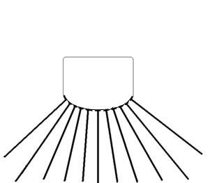
2D echocardiography. A line is sent out, and as all
echoes along the beam are received, the picture along the beam
is retained, and a new beam is sent out in the neighboring
region. building up the next line in the image. one full
sweep of the beam will then build up a complete image; i.e one
frame. A cine-loop is then a sequence of frames; i.e. a movie.
The present technology is sufficient to build up a picture
wit sufficient depth and resolution with about 50 frames per
second (FPS), which gives a good temporal resolution for 2D
visualisation of normal heart action ( about 70 beats per min.).
However, the eye has a resolution of about 25 frames per second,
so there may seem to be excess information. But off-line replay
may be done at reduced frame rate, thus enabling the eye to
utilise a higher temporal resolution.
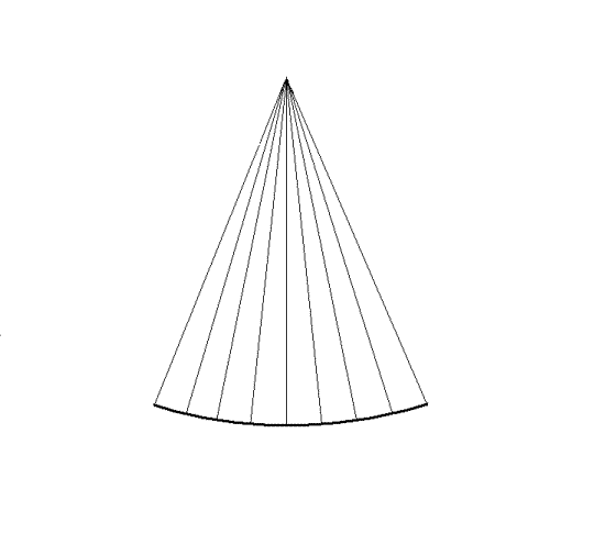
Line density
The width of the echo will be determined by the beam width, and
thus the distance between the beams (most ultrasound scanners
today will intrapolate between beams if the distance between the
beams is greater than the beam width). Ideally, the distance
between the beam width should be the same as the beam width at
the focal depth, for maximal resolution, thus lateral resolution
of a beam determining the
line density. This means
that the line density would be suited to the beam width. This,
however, holds only for a linear array.
- In a sector angle, the line density falls with distance
from the probe, as the lines diverge.
However, as the beam width also increases at depths greater than
the focal depth, the ideal line density for a sector probe is
the one where beam
distances are equal to the beam width at the focal
depth. This will give the best lateral resolution. A
line density that is so high as to make lines overlap, will not
result in increased lateral resolution. A line density that
leaves gaps between the lines, will have less than optimal
lateral resolution as determined by the probe aperture and focal
depth.
But as the time it takes to build each line in the image for any
given depth that is desired,
the number of beams in an image limits the frame
rate. And if a greater sector width is desired without
reducing the frame rate, the line density is reduced (same
number of lines over a wider angle).
Thus, the line density itself is limited by other factors
as well:
- Frame rate (including the depth).
- Sector width. Increasing sector width has to be
compensated either by lower frame rate or by lower
line density (keeping the same number of lines in a wider
sector) as shovn below.
- Depth in sector. As the sector width is increasing by
depth, lines diverge, and the line density falls
correspondingly.
Due to these factors, the line density often falls below the
theoretically desirable described above, and
the line density, not the
probe size and wavelength becomes the limiting factor
for the lateral resolution.
|
Two different lateral
resolutions, the speckles can be seen to be "smeared".
In this case the loss of resolution in the right image
is due to lower line density . By rights the image
should appear as split in different lines as indicated
in the middle, as each beam is separated, line density
being less than optimal relative to the beam width.
Instead the image is interpolated beween lines. This
reduction in line density is done to achieve a higher
frame rate, as illustrated below.
|
So a distinction should be made between the lateral
beam resolution, given by
the fundamental properties of the system, and the
image resolution that is a
compromise between the requirements of frame rate, angle width
and depth.
The discussion may be extended, taking all issues into
consideration:
|
|
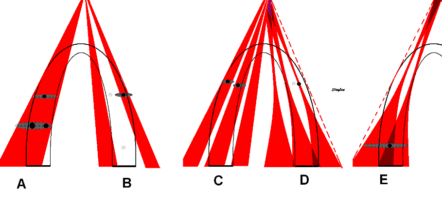
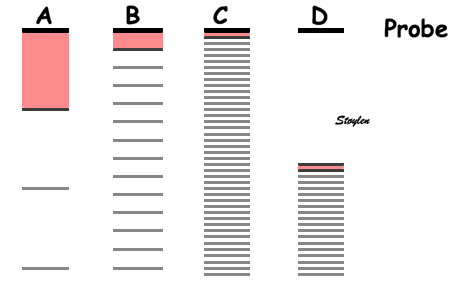
A:
Beam
width. Speckles (true speckles: black) are
smeared out across the whole beam width ( Apparent
speckles dark grey, top). This means that with this
beam width the speckles from to different layers
cannot be differentiated, and layer specific motion
cannot be tracked.
|
B:
Line
density. Only the lines in the ultrasound beams
(black) are detected, and can be tracked, beams
between lines are not detected or tracked. The spaces
between lines cannot be seen in the final image due to
image lateral
smoothing.
|
C:
Divergence
of lines in the depth due to the sector image will
both increase beam width and decrease line density in
the far field. this may result in the line density and
width being adequate (in this example for two layer
tracking) in the near field, but inadequate in the far
field, situation there being analoguous to A.
|
D:
Focussing.
The beams being focussed at a certain depth mau mean
that line density may be inadequate at the focus
depth. Thus speckles in some layers may be missed. IN
general, the default setting will usually give the
best line density at the focus depth, so unless frame
rate is increased, this problem may be minor.
Howewever, line density will decrease ifalso if sector
width is increased, there is a given number of lines
for a given frame rate and depth. In any case, in the
far field, the beams will be broader, and the beam
width will be more like A and C.
|
E:
Focussing may even result in beams overlapping int the
far field. A speckle in the overlap zone may be
smeared out across two
beams.
|
Thus, the line density can be increased by
- Reducing the sector width (gives higher line density by
spreading the lines over a smaller angle)
- Reducing frame rate (enables time for builing more lines
between frames)
- Reducing depth (enables a higher line density for a given
frame rate, as the shorter lines takes shorter time to
build).
This is discussed in detail below:
Temporal
resolution (frame rate):
To imagine moving objects, structures such as blood and heart,
the frame rate is important, related to the motion speed of the
object. The eye generally can only see 25 FPS (video frame
rate), giving a temporal resolution of about 40 ms. However, a
higher frame rate and new equipment offers the possibility of
replay at lower rate, f.i. 50 FPS played at 25 FPS, which will
in fact double the effective resolution of the eye.
In quantitative measurement, whether based on the
Doppler
effect or 2D B-mode data, sufficient frame rate is
important to avoid
undersampling.
In
Doppler,
the frame rate is also important in the
Nykvist
phenomenon.
The temporal resolution is limited by the sweep speed of
the beam. And the sweep speed is limited by the speed of sound,
as the echo from the deepest part of the image has to return
before the next pulse is sent out ad a different angle in the
neighboring beam.
Depth
If the desired depth is reduced, the time from sending to
receiving the pulse is reduced, and the next pulse (for the next
beam) can be sent out earlier, thus increasing sweep speed and
frame rate, as shown below.

|

|
As the depth
of the sector determines the time before next pulse
can be sent out, higher depth results in longer time
for building each line, and thus longer time for
building the sector from a given number of lines, i.e.
lower frame rate.
|
Thus reducing the
desired depth of the sector results in shorter time
between pulses, and thus shorter time for building
each line, shorter time for building the same number
of lines, i.e. higher frame rate. In this case, the
depth has been halved, and the time for building a
line is also halved.
|
For a depth of 15 cm, this means that the time for building one
line will be 2 x 0.15 m / 1540 m/s = 0.19 ms. The frame
rate is then given by the depth and the
number
of lines, which again is a function of sector width and
line density. Thus, for 64 lines the time for a full sector will
be about 12 ms, which in theory may give a frame rate of around
80 FPS, in practice the frame rate is lower, around 50.
The point of this, is that reducing the depth to the field of
interest will give a higher frame rate, that can either be used
for higher temporal resolution, or for increased spatial
resolution or sector width (see later). Looking at commercial
scanners, the effect of reducing depth is often surprisingly
little, this may be due to the manufacturers automatically using
the increased temporal capacity to increase line density rather
than frame rate.
Still, the field of view should be limited to the
field of interest. In practice, when studying the
ventricles, the atria should be excluded.
|
|
| In
this
case, in the image to the left, the depth has been
halved, reducing the time for building each line to
half, thus also reducing the time for building the
full sector, increasing the frame rate. |
Number
of beams: Sector width and line density.
The sweep speed can also be increased by reducing the number of
beams for a full sector. Reducing the number of lines in
the image will reduce the time for building up the whole image.
This can be achieved by either decreasing the sector angle
(width), but keeping the line density, i.e. reducing the field
of view but keeping lateral resolution. Decreasing the line
density, but keeping the same sector angle will achieve
the same increase in frame rate, but reduce lateral
resolution.

|
|
|
| A sector with a given depth,
sector width and line density determines the frame
rate. |
Reducing sector width, but
maintaining the line
density, gives
unchanged lateral
resolution but higher frame rate,
at the cost of field of view. |
Reducing the line density
instead and maintaining sector width, results in
lower number of lines, i.e. lateral resolution, and
gives the same increase in frame rate. |
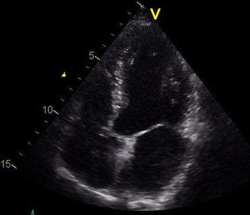
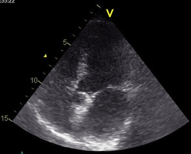
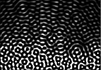
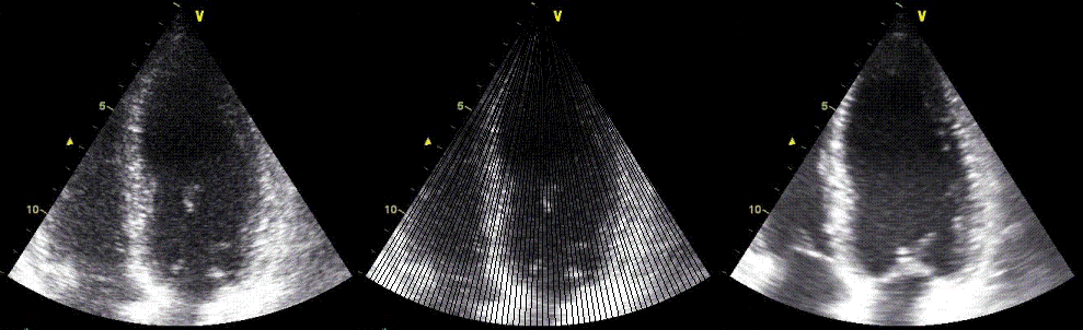
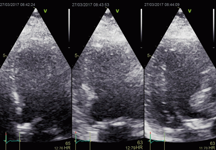
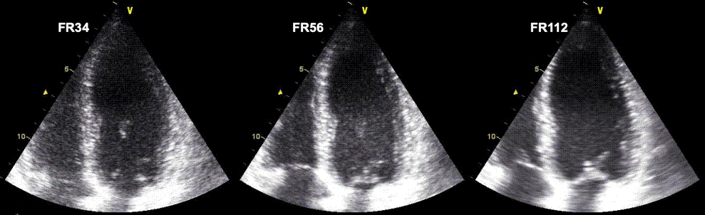 Ultrasound
acquisitions of the same ventricle at frame rate 34 (
left), 56 (middle) and 112 (right), all other setting
being equal. Increased frame rate is achieved by reducing
the number of lines; i.e. the line density. This can be
seen as an increasing width of the speckles in the image
with increasing frame rate, resulting in a lateral
blurring of the image. The first step from 34 to 56 seems
to retain an acceptable image quality, indicating that the
line density was redundant at the lowest frame
rate. ( In fact, it may seem that the image in the
middle has the best quality, as the left image seems more
grainy. But the graininess is the real appearance of the
echoes, while the more homogeneous appearance in the
middle and the left is due to smearing). However, as line
density decreases toward the bottom of the sector (by the
divergence of the lines), the effect is mos clearly seen
here, i.e. in the atrial walls, the mitral ring and
valve. In the image to the right, the endocardial
definition is lost. As it is the echoes that are
smeared, the effect will result in an apparent decreased
cavity size.
Ultrasound
acquisitions of the same ventricle at frame rate 34 (
left), 56 (middle) and 112 (right), all other setting
being equal. Increased frame rate is achieved by reducing
the number of lines; i.e. the line density. This can be
seen as an increasing width of the speckles in the image
with increasing frame rate, resulting in a lateral
blurring of the image. The first step from 34 to 56 seems
to retain an acceptable image quality, indicating that the
line density was redundant at the lowest frame
rate. ( In fact, it may seem that the image in the
middle has the best quality, as the left image seems more
grainy. But the graininess is the real appearance of the
echoes, while the more homogeneous appearance in the
middle and the left is due to smearing). However, as line
density decreases toward the bottom of the sector (by the
divergence of the lines), the effect is mos clearly seen
here, i.e. in the atrial walls, the mitral ring and
valve. In the image to the right, the endocardial
definition is lost. As it is the echoes that are
smeared, the effect will result in an apparent decreased
cavity size.
These images also illustrates the drawback of time
gain compensation, all three images has the same
TGC, showing about the same brightness of the walls from
base to apex, (the attenuation being offset by the TGC),
but with increasing cavity noise.Multiple line
acquisition (MLA)
However, a method for increasing the frame rate for a given
sector and line density, is to fire a wide transmit (Tx) beam,
and listen on more narrow receiver (Rx) beams (crystals)
simultaneously. This is called multiple line acquisition (MLA),
and is illustrated below:
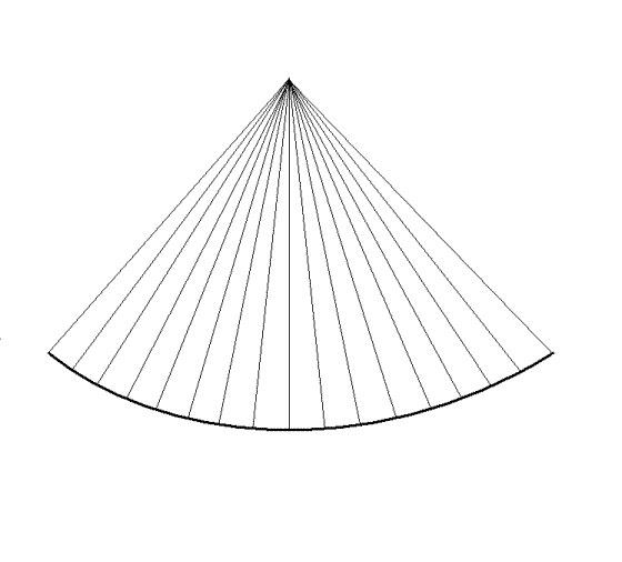
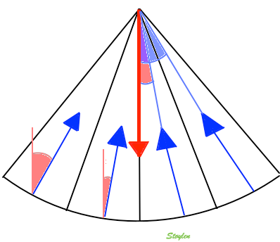
In this example, a wide
beam is fired, and for each of the four transmit beams,
there are four receiver beams (4MLA). thus, the frame rate
is increased fourfold for the same number of lines.
Limitations of the MLA
technique
The MLA has limitations that are especially
important in forming the B-mode image.
 |
 |
| MLA angle
discrepancy. The width of one transmit beam is
exaggerated for visualisation. One wide beam is
transmitted, and four narrow recieve
beams. The transmit beam has has a main
direction shown by the red arrow. The receive
beams has directions (blue arrows) with an angle
to the transmit beam, and this angle increases
with increasing distance of the receive beam
from the middle of the transmit, i.e. with the
MLA factor. |
MLA
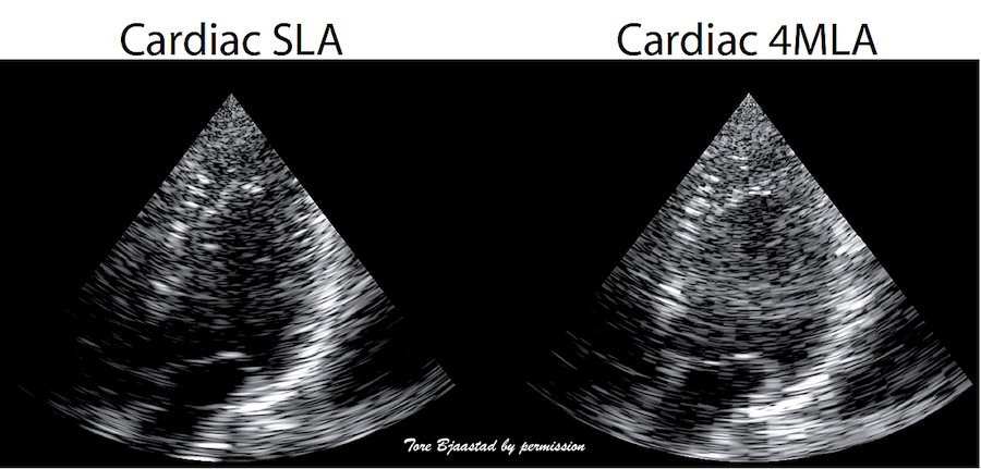
angle artefacts in B-mode. Left: single line
acquistion, where frame rate is acquired by a fairly
low line density, and the image is then smoothed
with interpolation between scanlines as described above,
right, 4MLA acquisition. This should in principle
result in a quadrupling of the number of lines, and
an image with better lateral resolution. However,
the increasing angle deviation between the Tx beam
and the RX beams in the lateral parts of the Tx,
will result in the lines being visible as blocks,
the improvement in image quality being negligible or
none. Image courtesy of Tore Bjaastad. |
Image smoothing this in the image will result in
"smearing", and hence, reduced resolution again.
Thus, increasing frame rate with MLA and then
smoothing the image, becomes similar to increasing
frame rate by reduced line density. Thus,
in B-mode, where
image quality is the main focus, there has been a
practical limitation of 2 MLA.
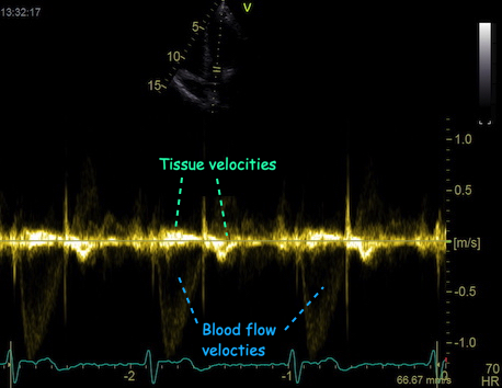
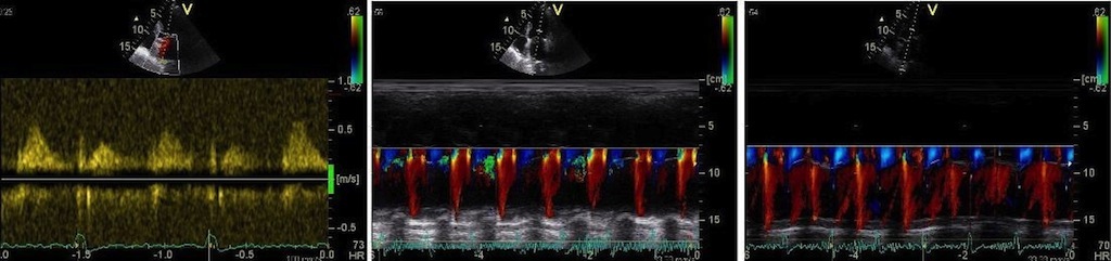
In tissue Doppler, the image quality is of less concern, as
the main emphasis is on velocity data, rather than image
quality. Thus, the MLA factor, and hence, the frame rate of
tissue Doppler is thus usually higher, but at the cost of
lower lateral resolution. This may not be apparent, unless
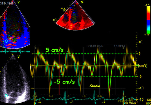
one compares data across the beams. An example can be seen here.
In practice, the MLA factor can at least be increased to 4
MLA.
However, modern equipment will allow more data to be
transmitted directly into the scanner, and modern computer
technology allows more data processing at higher speed.
Thus, technology will become far more complex, and neither
traditional beamforming nor image processing conforms to
the simple principles described here, but they will still
serve to give an idea. And
the physical principles still apply.
In practice, for modern B-mode, frame rates will become similar
to colour tissue Doppler, when the MLA
artefact preoblem is dealt with.
3D ultrasound
3D ultrasound increases complexity a lot, resulting in a new
set of additional challenges.
The number of crystals need to be increased, typically from
between 64 and 128 to between 2000 and 3000. However, the
probe footprint still needs to be no bigger than being able to
fit between the ribs. And the aperture
size must still be adequate for image resolution.
The number of data channels increases also by the square,
from 64 to 642 = 4096. This means that the
transmission capacity of the probe connector needs to be
substatially increased, and some processing has to take place
in the probe itself to reduce number of transmission channels.
.
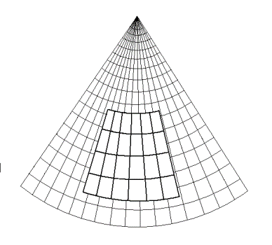
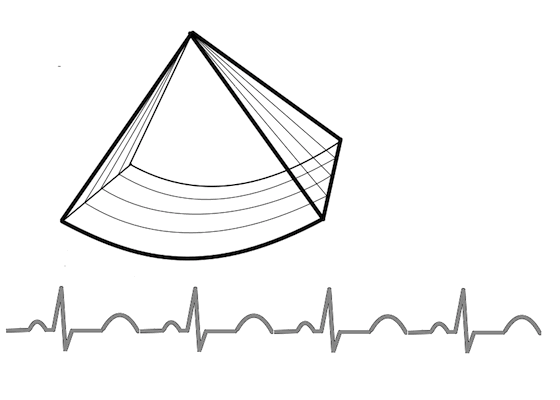
The number of lines also increase by the square of the number
for 2D, given the same line density, meaning that each
plane shall have the same number of lines, and a full volume
then shall be n=built by the same number of planes. This means
that given 64 lines per plane, the number of planes should be
64, which means a total of 64 x 64 = 4096 lines. This means
that the frame rate (usually termed the "volume rate" in 3D
imaging), will be 0.19 ms x 4096 = 778 ms, or about 0.8 secs.
Meaning about 1 volume per heartbeat for a heart rate of 75.
This is illustrated below.
|
|
Building a 2D sector with
lines. (Even though each line (and the sector) has a
definite thickness, this is usually not considered
in 2D imaging, except in beamforming for image
quality.
|
Building a 3D volume. Each
plane has the same number of lines as in the 2D
sector to the left, and takes as long to build. The
number of planes equals the number of lines in each
plane. Here is shown only the building of the first
plane (compare with left), but the time spent on
each of the following planes are in proportoion. The
time for a full volume is then equal to the square
of the number of lines in each plane.
|
This means that full volume 3D ultrasound has to pay a price of
a substantially reduction in both frame rate and line density
(resolution) at the same time. Thus, the lateral resolution is
poor in 3D acquisition compared to 2D acquisition. The images
can be seen to be very smoothed, compared to 2D.
Possible compensations are:
- MLA
technique, as the MLA gating will reduce the time used
for each plane, and if used in both coordinates (lateral
and azimuth) it will reduce the time by the square of
the MLA factor. Thus 3D 4MLA is equivalent to 2D 2MLA, 3D
16MLA is equivalent to 2D 4MLA. But as discussed above,
increased MLA factor will need smoothing to compensate for
MLA artefacts, and thus increased volume rate is achieved at
the cost of resolution. This is very evident in 3D echo from
vendors who offer 16 mLA, images are extremely smoothed.
Thus, even if some vendors have a high frame rate, images
can be seen to be very smoothed, while others have
maintained a better resolution, but at the cost of very low
volume rate, often down to 5 VPS. This has to be
compensated, for instance by stitching.
- Gated acquisition
(stitching). In ECG gated mode, only a part of the sector is
taken in one heartbeat, allowing a higher line density as
well as higher number of planes in the partial sector. Next
part of the sector is than taken in the next heartbeat, and
the two volumes are aligned by ECG gating. This is
illustrated below.
 Gated volume acquisition (stitching)
.
In
this case of four heartbeats. Only one fourth of the full
volume is taken in one heartbeat, so the full heartbeat is
used for increased number of lines and planes, as well as
shortening the time for the acquisition of the partial
volume. In the next heartbeat, the next fourth of the
volume is acquired, and so on acquiring a full volume in
four heartbeats. The four partial volumes are then aligned
by ECG gating into one reconstructed volume, and the
reconstructed volume thus has the same volume rate as the
four partial volumes.
Thus, the limitation in 3D sector size can be used both for more
lines (resolution) and increased volume rate. However, the
reconstructed acquisition is no longer real time.
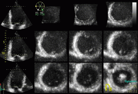
Volume acquisition can then be displayed as either a surface
rendering, or multiple section planes through the volume:
|

|
Surface rendering of a 3D
volume. The image shows a cut through the LV between
base and apex, looking down toward the base, the
papillary muscles and mitral valve can be seen.
The illustration also shows that the temporal
resolution is to low to actually show the opening of
the mitral valve during trial systole, only a slight
flicker can be seen at end diastole.
|
The same volume, now displayed
as a series of short axis slices
from apex (top left) to base (bottom right).
A slight stiching artefact (spatial
discontinuity) can be seen in the anterior wall (top
of each slice).
|
The rendering is mainly useful for morphology, especially
valves, but here, TEE gives better images. The short axis slices
are more useful in assessing wall motion.
- Display of morphology, especially mitral leaflets
(resolution not good enough for aortic from the apical
position), this is vastly improved by 3D TEE.
- Volume measurement. A good 3D volume eliminates
foreshortening that may be masked by moving the probe in
separate 2D planes. Some studies have shown better validity
and reproducibility by 3D than 2D, although poorer
feasibility.
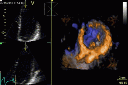
- Regional wall motion assessment, especially in the base.
Basal segments may move due to tethering,
even if there is no intrinsic function. On the other hand,
normal segments may display apparent dyskinesia die to out
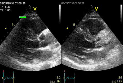
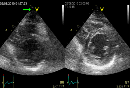
of plane motion, especially in the inferior wall.
Assessing wall motion in cross sections, is visually easier.
Also, wall thickening, as different from wall motion, may be
easier to see in the cross sections.
The disadvantage of this is that each full-volume heart cycle is
constructed from multiple beats, and small movements, f.i. by
respiration, may result in mis alignment of wall segments. The
acquisition is thus usually taken in a breathold, and thus there
is a practical limitation to the number of beats that can be
stitched. Usually four to six are used, six being at the limit
for many patients. Four beats, by most vendors now will result
in a volume rate of around 20 VPS.
Any small movement will result in mis alignment of the sub
volumes, with a sharp boundary within the volume where there is
both spatial and temporal discontinuity (stitching artefact).
|
|
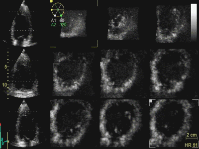
3D acquisition of a ventricle
with inferior infarct. The display is shown as the
apical planes to the left, and nine cross sectional
planes to the right, going from the apex (top left)
to the base (bottom right - reading order). The
infarct can be seen as inferoseptal a - to
dyskinesia in the basal sections. The image also
illustrates that the software can be enabled to
track the planes, thus eliminating out of plane
artefacts when evaluating wall motion. Note
that there is drop outs that cannot be eliminated by
moving the imaging plane, in the anterior wall.
Image courtesy of Dr. A. Thorstensen .
|
Styitching artefacts. In this
volume, reconstructed from four heartbeats, i.e.
four sub volumes, there are stitching artefacts
between each of the sub volumes. This is due
to motion of either the heart (f.i.) because of
respiration, or of the probe. In the inferior wall
(bottom of each slice), the spatial discontinuity
is very evident, less so at the other
stiches,, but in the anterior wall there is a
discontinuity that illudes a dyssynergy.
|
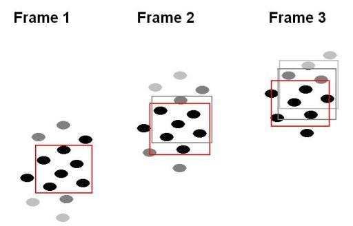
Foreshortening
For correct display of the left ventricle, the imaging plane has
to transect the apex. This is ensured by finding the apex beat
by palpation. However, the apex does not necessarily offer the
optimal window for imaging, and the intercostal space above may
give a better view. However, this may lead to a geometrical
distortion as illustrated below:
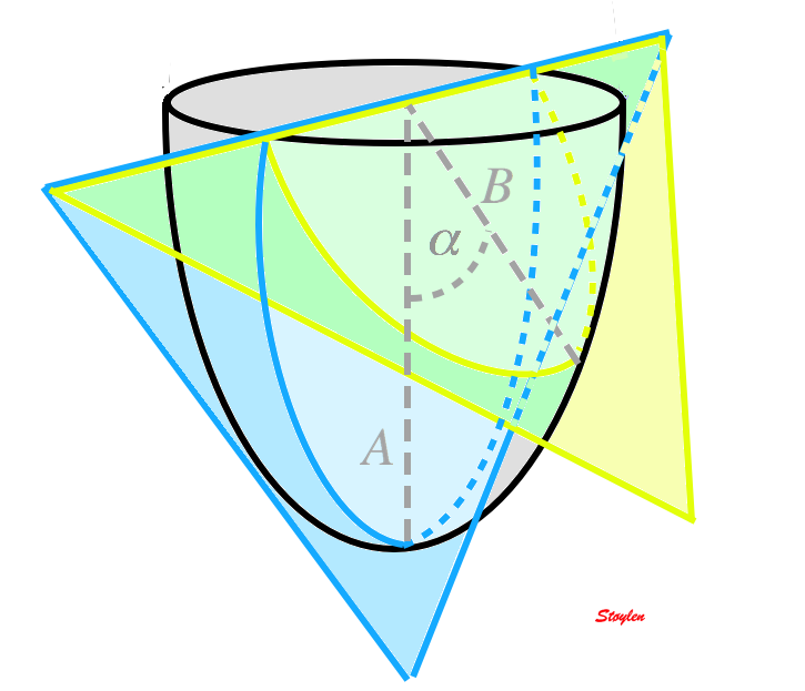 Correct transapical plane (blue) versus
foreshortened plane (yellow). Firstly, it is evident that
the foreshortened plane excludes parts of the apical wall,
but the foreshortened image still shows an ellipsoid
figure, so the foreshortening is not immediately evident.
There is an angle between the planes (
Correct transapical plane (blue) versus
foreshortened plane (yellow). Firstly, it is evident that
the foreshortened plane excludes parts of the apical wall,
but the foreshortened image still shows an ellipsoid
figure, so the foreshortening is not immediately evident.
There is an angle between the planes ( ), and the apparent longitudinal
wall in the foreshortened image is actually partly
circumferential.
), and the apparent longitudinal
wall in the foreshortened image is actually partly
circumferential.
This is shown in the images below:
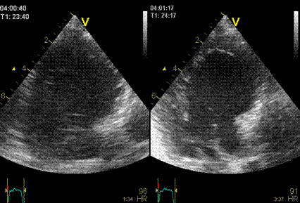
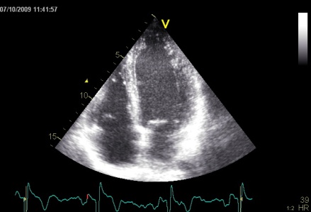
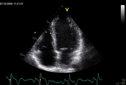
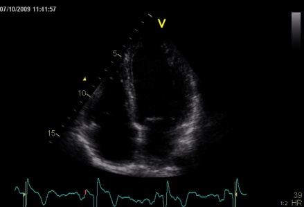
Foreshortening. The three images are taken with
identical gain, compress and reject settings. Left: correct
apical position, showing the apex in
the centre of the sector. The wall vivibility is poor.
MIddle: by moving the probe one intercostal space higher,
the wall visibility becomes much better. However,
the ventricle canbe seen to be foreshortened, being much
shorter than in the left image. But this is only evident by
the comparison, without the reference
image to the left, this is not apparent, as the (virtual)
apex is in the centre of the sector. However, rotationg the
probe to the two-chamber posisition, reveals that the apex
in fact is not in the centre at all, thus the four chamber
image is foreshortened.
The foreshortened image in four chamber view may seem to be
better, at least for wall motion assessment, but the
consequences may be:
- Volumes and LV length will be underestimated (I've seen
diagnosed bi atrial enlargement due to foreshortening simply
because the normal atria looked bigger in relation to the
foreshortened ventricle)
- The apex is not imaged, and any apical abnormalities will
be missed as seen below:
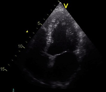
 Stress echo image at peak stress. The foreshortened
image to the left shows good wall visibility, and apparent
normal wall motion in all segments. Left: correct
placement of the probe as seen by the slighty longer
ventricle, shows poorer visibility, but the akinetic
apicolateral part of the wall is evident, showing how
foreshortening may almost totally mask any abnormality in
the apex (Although some asynchrony may be seen).
Stress echo image at peak stress. The foreshortened
image to the left shows good wall visibility, and apparent
normal wall motion in all segments. Left: correct
placement of the probe as seen by the slighty longer
ventricle, shows poorer visibility, but the akinetic
apicolateral part of the wall is evident, showing how
foreshortening may almost totally mask any abnormality in
the apex (Although some asynchrony may be seen).
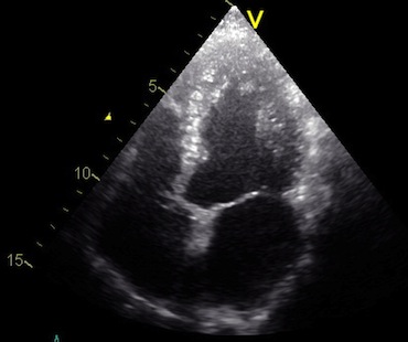
Another example is shown below:
 In this case, there is foreshortening in the four
chamber view (left), which is not very evident. However,
automatic adjustment of probe position when rotating to
2-chamber view (middle) and long axis view (left) masks
the fact that there is foreshortening. The para apical
position in the two latter views, however, is evident by
the inward motion of the apical endocardium.
In this case, there is foreshortening in the four
chamber view (left), which is not very evident. However,
automatic adjustment of probe position when rotating to
2-chamber view (middle) and long axis view (left) masks
the fact that there is foreshortening. The para apical
position in the two latter views, however, is evident by
the inward motion of the apical endocardium.
- and the apical aneurysm evident on this ventriculogram
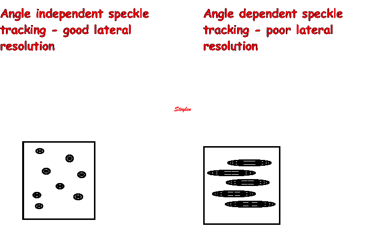
is missed.
- The anterior wall is partly apical and partly
circumferential. Thus longitudinal shortening, especially by
speckle tracking may be circumferential rather than
longitudinal. This may also be related to the curvature
dependency of strain as measured by speckle
tracking.
Non
linear wave propagation and harmonic imaging.
Non linear propagation of the signal in the body, leads to
distortion of the waves in the signal. But this again leads to a
dispersion of the wavelength content in the signal, as assessed
by Fourier analysis in the received signal.
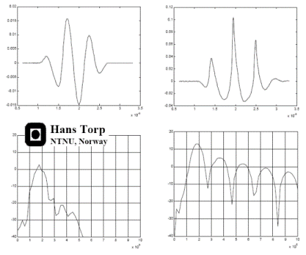 Non-linear propagation. The upper panel shows the
waveform of a pulse as originally transmitted, and after 6
mm transmission through tissue. The lower panels shows how
the energy distribution is shifted to a more evenly
distribution between more frequencies. (image courtesy of Hans Torp).
Non-linear propagation. The upper panel shows the
waveform of a pulse as originally transmitted, and after 6
mm transmission through tissue. The lower panels shows how
the energy distribution is shifted to a more evenly
distribution between more frequencies. (image courtesy of Hans Torp).
By Fourier analysis it is thus possible to send at half the
frequency (typical 1.7 MHz as opposed to 3.4 MHz in native
imaging), but receive at the same frequency (the second harmonic
frequency: Twice the frequency is one octave higher). Thus, it
improves penetration, which is important especially in obese
subjects, while it retains the resolution (almost).
|
|
| Fourier analysis
of the resulting signal in native frequency (left)
and second harmonic mode (left) shows that the
native signal contains much more energy at all
depth, while the harmonic signal contains most of
the energy at a certain depth, in this case at the
level of the septum, showing a much better
signal-to-noise ratio.(image courtesy of Hans
Torp). |
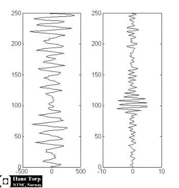
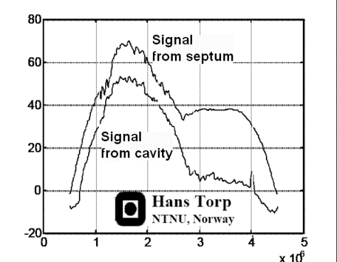
Energy
distribution of the signal from cavity (lower curve)
and septum (upper curve), showing the same
phenomenon as the middle picture. The difference
between cavity signal (being mostly clutter) and
tissue is small in the native frequency domain (1.7
MHz), but there is little clutter at the harmonic
frequency (3.4 MHz). Thus, filtering the native
signal will reduce clutter, as shown below. (image courtesy of
Hans Torp). |
The noise from
clutter and aberrations is mainly in the primary
frequency, so the use of second harmonic will suppress
noise, improving the noise-to-signal ratio. Also, the
echoes from the side lobes are mainly in the primary
frequency and will be reduced in second harmonic
imaging.
Harmonic imaging, however removes all energy in the
primary frequency. This means that there is an over all
reduction in the reflected energy, even with improved
signal to noise ratio. This means that there is
limitations to how low it is possible to go in trnsmit
energy (for instance i contrast echo). In addition,
focussing is more important as this consentrates the
energy in the beam.
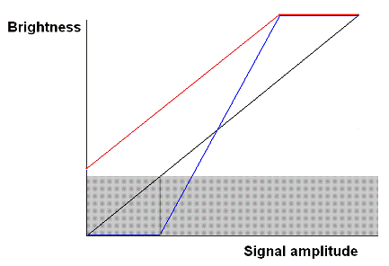
Thus second harmonic imaging leads to:
1: Reduced noise and side lobe artifacts
2: Improved depth penetration.
Examples of the effect of harmonic imaging can be seen
below.
|
|
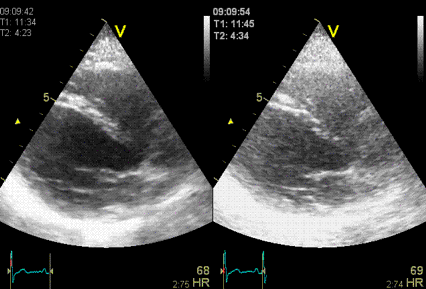
The same image
in harmonic (left) and fundamental (right) mode, showing
the improved signal-to-noise ratio in harmonic
imaging, especially in rducing noise from the
cavity. (Thanks to Eirik Nestaas for
correcting my left-right confusion in this image
text)
|
Stationary
reverberation in harmonic (left) and fundamental
(right) imaging, showing the effect of harmonic
imaging on clutter.
|
However, due to the increase in pulse length with lower
frequency, harmonic imaging also leads to:
3: Thicker echoes from speckles as discussed above.
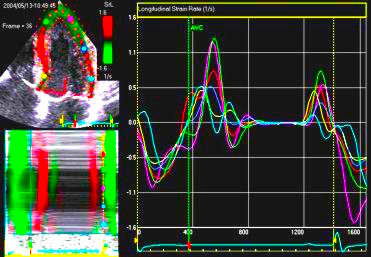
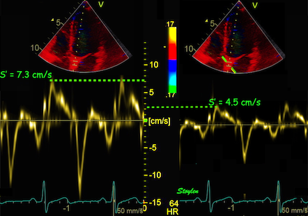
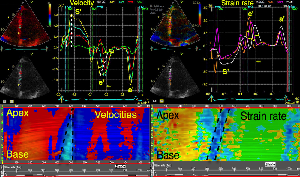
Methods for
regional deformation measurement
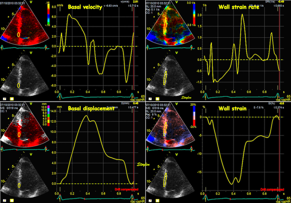
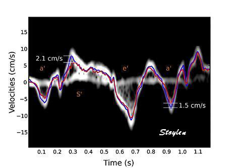
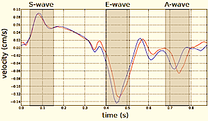
While global LV function can be assessed by longitudinal motion
measures of the mitral ring;
annular
velocity (S') and
annular
displacement (MAPSE), both global and regional function
can be measured byt the motion measures per length unit,
strain
rate and
strain.
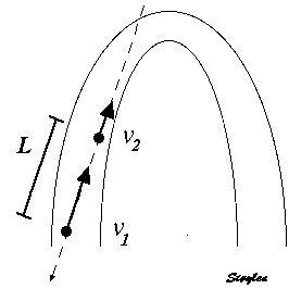
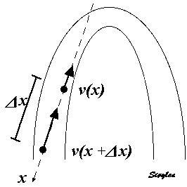
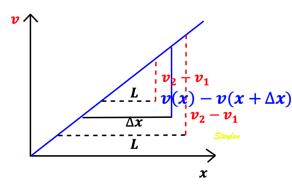
In order to asses regional motion, one has to access multiple
(minimum two) measurements at different sites in order to do a
spatial derivation of the difference, as
explained
in the basic concepts section..
In the present ultrasound the methods available for multiple
sites motion measurement, are speckle tracking and colour
tissue Doppler.


.jpg)