![]()
 |
Basic Doppler ultrasound for clinicians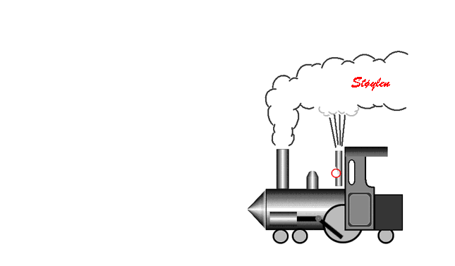 |
 |
| Christian Andreas Doppler (1803 - 1853) |
The Doppler effect |
My cat Doppler (2004 - 2019) |
The Doppler effect was discovered by Christian Andreas
Doppler (1803 - 1853), and shows how the frequency of an
emitted wave changes with the velocity of the
emitter or observer. The theory was presented in the royal
Bohemian society of Science in 25th of May1842 (5
listeners at the occasion!), and published in 1843 (119).
The premises for his theoretical work was faulty, as he
built his theory on the work of James Bradley who
erroneously attributed the apparent motion of stars
against the background (parallax effect) to the velocity
of the earth in its orbit (instead of the effect of
Earth's position in orbit on the angle of observation).
Further, Doppler attributed the differences in colour of
different stars to be due to the Doppler effect, assuming
all stars to be white. Finally, he theoretised over
the effect of the motion of double stars that rotate
around each other, assuming a Doppler effect
from the motion. The changes in wavelength from the
Doppler effect, however, is too small to be observed.
However, Doppler did a theoretical derivation of the effect of the motion of the source or observer on the perceived wavelength from the premises of a constant propagation velocity of the waves in the medium, and this is entirely correct, valid both for sound waves and electromagnetic radiation of all kinds. The basis for the Doppler effect is that the propagation velocity of the waves in a medium is constant, so the waves propagates with the same velocity in all directions, and thus there is no addition of the velocity of the waves and the velocity of the source. Thus, as the source moves in the direction of the propagation of the waves, this does not increase the propagation velocity of the waves, but instead increases the frequency.The original derivation of the Doppler principle as well as the extension to reflected waves is explained in more detail here. As a work of theoretical physics, it is thus extremely important. In addition, it has become of practical importance, as the basis for the astronomical measurement of the velocity of galaxies by the red shift of the spectral lines, in Doppler radar, Doppler laser and Doppler ultrasound.
The theory was experimentally validated by the Dutchman
Christoph Hendrik Diderik Buys Ballot (120),
with the Doppler effect on sound waves, who placed
musicians along a railway line and on a flatbed truck, all
blowing the same note, and observed by subjects with
absolute pitch, who observed the tones being a half note
higher when the train was approaching as compared to the
stationary musicians, and a half note lower as the train
receded.
(This can be observed in everyday phenomena such as the sound of f.i. an ambulance siren, the pitch (frequency) is higher when the ambulance is coming towards the observer, hanging as it passes, and lower as it goes away.
This is illustrated below:
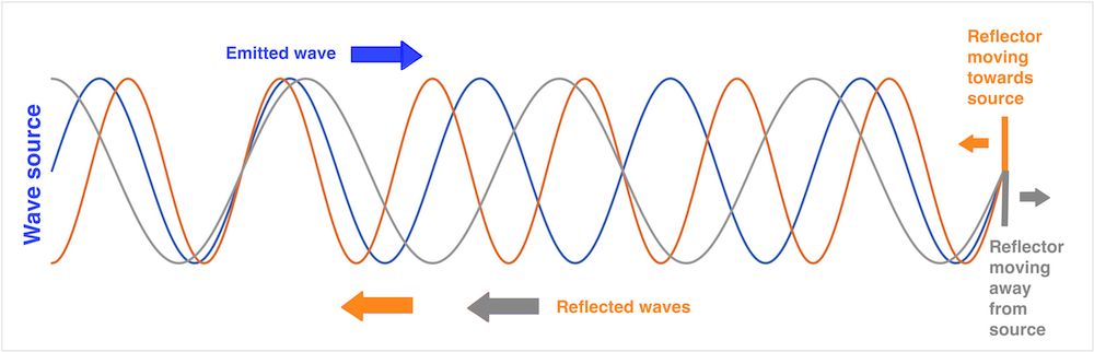
The
Doppler effect. As the velocity of sound in air (or
any other medium ) is constant, the sound wave will
propagate outwards in all directions with the same
velocity, with the center at the point where it was
emitted. As the engine moves, the next sound wave is
emitted from a point further forward, i.e. with the
center a little further forward. Thus the distance
between the wave crests is decreased in the direction
of the motion, and increased in the opposite
direction. As the distance between the wave crests is
equal to the wavelength, wavelength decreases (i.e.
sound frequency increases) in front of the engine, and
increases (sound frequency decreases) behind it. This
effect can be heard, as the pitch of the train
whistle is higher coming towards a listener than
moving away, changing as it passes. The effect on the
pitch of the train whistle was published directly, but
later than Doppler and Buys Ballot.

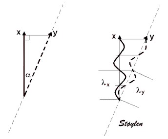
| A |
B |
 The Doppler effect for a stationary wave source and a moving observer. For the time the wave has moved the distance  . This results
in an apparent shortening of wavelength
(increase in frequency) as shown by
Doppler (119)
and reproduced below this image. . . This results
in an apparent shortening of wavelength
(increase in frequency) as shown by
Doppler (119)
and reproduced below this image. . |
 The Doppler effect for a moving source and a stationary observer. In the time between waves (which is 1/f0), the source has moved the distance  and the apparent
wavelength . This results
in an apparent shortening of wavelength
(increase in frequency) as shown by
Doppler (119)
and reproduced below this image. and the apparent
wavelength . This results
in an apparent shortening of wavelength
(increase in frequency) as shown by
Doppler (119)
and reproduced below this image.Thanks to Hon Chen Eng of University of Toledo who pointed out an inconsistency in the original illustration and showed a better way of illustrating the Doppler effect in this image. |
An observer
(blue) moving towards a stationary wavesource
with the velocity: by by  , i.e: , i.e:    The change in
frequency, the Doppler shift is:  |
If the source moves toward a
stationary observer In the time the wave moves
one wavelength, the source moves the
distance:
The motion of
the wave and the motion of the
source happen during the same time
interval:
 The distance from the next wave emitted from the new position of the source (small dotted red circle) to the observer (blue) is shortened by in the
direction of the motion, so the new
wavelength representing the distance
between the first and second waves is
Thus:
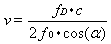
   The change in frequency, the Doppler shift is:  If v << c, then:   and:
 |

 as discussed below, in the case of
reflected ultrasound, the angle is the angle between
the emitted ultrasound beam and the velocity
vector. Thus the full Doppler equation for reflected
ultrasound is:
as discussed below, in the case of
reflected ultrasound, the angle is the angle between
the emitted ultrasound beam and the velocity
vector. Thus the full Doppler equation for reflected
ultrasound is:
As described in the
basic ultrasound section, distances (e.g. wall
thickness) and motion by M-mode) increases with
increasing angle:
| As a reflector moves
from a to b in the direction 1, the true
motion (displacement) is L1.
If the ultrasound beam deviates from
the direction of the motion by the angle
|
The angle error in displacement measurement demonstrated in a reconstructed M-mode. Increasing angle between M-mode line and direction of motion increases the overestimation of the MAPSE. |
| Basically, the measured velocities decrease by the cosine function, being 0 at 90° insonation: | Angle distortion in
Doppler. The image on the left has
applied angle correction, and then
adjusted to scale. |
 |
 |
 |
|
| Phase
analysis. If the waveform
is treated as a sine curve, every
point on the curve corresponds to an
angle, and the phase of the point in the
curve can be described by this angle; the
phase angle |
However, from
the diagram at the top, it is evident that
by sampling the waveform only once, the
phase is ambiguous, it is not possible to
separate the phase of point a from point
b. The two points are separated by a
quarter of a wavelength, or 90° ( |
 |
 |
 |
| Two pulses sent toward a scatterer with a time delay t2 - t1 = 1/PRF. Given that the scatterer has a velocity, it will have moved a distance, d, that is a function of the velocity and the time (d = v x t). Thus, pulse 2 travels a longer (or shorter) distance equal to d with the speed of sound, c, before it is reflected. | During the
time pulse2 has travelled the distance d
to the new position of the scatterer and
back to the point of the reflection of
pulse 1, i.e. a distance 2d, pulse
1 has travelled the same distance away
from the reflection point. (The
scatterer will have travelled further,
but this is not relevant). Thus
the displacement of the waveform of
pulse 2 relative to pulse 1, is 2d. This
corresponds to a phase shift from pulse
1 to pulse 2 of |
By sampling the two pulses simultaneously at two timepoints, as shown in the previous illustration, the phase of each pulse can be determined as shown below. |
equals 2 equals
the phase shift = = c/f, it follows that:| A series of pulses
shot successively. It is also evident
the even without motion, there is a
phase shift between pulses, but this is
equal for transmitted and reflected
ultrasound |
Measuring the
velocity of an object by phase analysis.
The velocity of the scatterer is shown
by the dotted red line, showing the
phase in each pulse, and then the phase
shift through the pulse package is
illustrated by the full sinusoid red
line shown to the left, where the
troughs and peaks of the red line
represents the scatterer's position at
the peaks and troughs of each pulse,
i.e. the phase in trelation to the twop
pulses. In principle, the phase shift
can be sampled between each pulse pair.
The sinusoid curve is the phase shift
curve, and the frequency is equal to the
Doppler frequency. |

| Amplitude imaging (B-mode). Tissue echoes have a high amplitude, blood a low amplitude (due to low reflexivity). Thus tissue is visualised , while the blood is not visible in the present gain setting. | As seen from the
B-mode image to the left, the tissue is
not stationary, but the velocities are
low, compared to blood. |
| Too see blood flow
velocities, it is possible to increase
gain, but that will also increase the
low velocity signals from the tissue to
saturation. They are generally
considered clutter nois, when dealing
with blood flow, although it is not true
clutter in the reverberation sense.
|
It is possible to
filter the low velocities by a "high
pass filter", that allows high
velocities to pass, while removing low
velocity signals independent of
amplitude. This will remove both tissue
signals and reverberation noise. The low
velocities around the baseline have been
removed, the width of the filter is
indicated by the green band to the left.
This is also called "clutter filter" or
"low velocity reject". |

| As described above,
the reflected signal contains multiple
Doppler frequencies, because the blood
flow has multiple velocities. This is
shown above, left exemplified by three
velocities. Different amounts of blood
have different velocities, as indicated
by the line thickknesses.Below is shown
the compound cirve resulting from the
three frequencies, which is the signal
received by the probe. |
Fourier analysis
can resolve the frequencies into
different sine curves with different
frequencies again. IN this case the
method is called fas Fourier transform.
The different amount of blood with each
velocity will result in different
amplitude of the signal in the different
frequencies as shown below. |
| Depth |
SI |
PRF |
| 1 cm |
0.000013s |
77000 Hz |
| 5 cm |
0.00006s |
15400 Hz |
| 10 cm |
0.00013s |
7700 Hz |
| 15 cm |
0.00019s |
5133 Hz |
| 20 cm |
0.00026 s |
3850 Hz |
| Phase shift
analysis. The distance between the
pulses represent the pulse interval, or
1/pulse repetition frequency (1/PRF) |
This means that the
phase shift curve can be sampled only
with a frequency equal to the PRF.
Halving the pulse repetition frequency
doubles the sampling interval. This
results in the Doppler shift curve being
sampled at half the number of pulses.
This may result in velocity ambiguity as
described below. |
A more rapidly moving scatterer will then result in a higher frequency of the phase shift, i.e. a higher Doppler frequency. Thus the frequency is proportional to the velocity. It also means that the phase shift curve is sampled fewer times per oscillation, giving an equivalent effect as reducing the PRF.. |
The Nykvist phenomenon (121) is an effect of the relation between the sampling frequency and the observed velocity. If you sample at a certain frequency, the direction of the motion becomes ambiguous, more frequent sampling will give the correct direction, less frequent sampling results in an apparent motion in the opposite direction. This can be observed with a stroboscopic light, for instance illuminating the flow of water
| Cw Doppler,
sampling the phase shift curve (Dopplwer
frequency) once per pulse. The curve is
very well reproduced. |
Pw Doppler samples
the curve with much lower sampling
frequency (PRF), but still sufficient so
the curve can be reproduced, both the
value and direction of the velocity can
be measured. |
Pw Doppler where
sampling frequency (PRF) is 4 × the
Doppler frequency. The curve will still
reproduce the troughs and peaks of the
curve, and the information of the
direction, and doesn't fit the alternate
curve (same frequency, but out of phase
(corresponding the the same velocity in
the opposite direction. |
| Sampling at 2 × the
Doppler frequency (i.e.) twice per
oscillation, PRF = 2
× fd, the curve cannot be reproduced,
i.e. the Doppler frequency cannot be
measured, the samples fit both curves
equally well, and the velocity direction
is ambiguous. |
- and the samples
fit equally well the double Doppler
frequency, i.e. twice the velocity. |
Finally when PRF is
< 2 × Fd, the sampling will fit other
velocities as well, in this case 1.5 ×
velocity. |
This is illustrated below as an example.
Constant rotation velocity, decreasing sampling frequency:The easiest
is to show how reducing the sampling
frequency affects the apparent motion. All
circles rotate with the same rotation
velocity clockwise. The sampling frequency
is reduced from left to right. It can be
seen that the red dots is at the same
positions when they are seen to move.
|
|||
 |
 |
 |
 |
| a:
8:1 8 samples per rotation, the red point is seen in eight positions during the rotation. |
b:
4:1 4 samples per rotation, the red point is seen to rotate just as fast, but is only seen in four positions |
c: 2:1 2 samples per rotation, i.e. the sampling frequency is exactly half the rotation frequency. Here, the red dot is only seen in two positions, (but it is evident that it is in the same positions at the same time as in a and b). However, it is impossible to decide which way it is rotating. This is the Nykvist limit; sampling rate = 1/2 rotation rate. |
d:
1.5:1 1.5 samples per rotation,or one sample per three quarter rotation, making it seem that the red dot is rotating counter clockwise. Again, the dot is in the same position at the same time as in a and b. |
|
|
|||
 |
 |
 |
 |
| a:
1:8 One rotation per 8 samples. The sampling catches the red dot in 8 positions during one rotation. |
b:
1:4 Rotation velocity twice that i a; one rotation per four samples, the sampling catches the red dot only in four positions during one rotation. |
c: 1:2 Rotation velocity four times a; one rotation per two samples, this catches the red dot in only two positions, giving directional ambiguity as above. |
d:
1:1,5 Rotation velocity six times a; one rotation per 1,5 samples, or 3/4 rotation per sample, giving an apparent counter clockwise rotation. |
Sampling from increasing depth
will increase the time for the pulse
returning, thus increasing the sampling interval
and decrease the sampling frequency.
The Nykvist limit thus decreases with depth. This
means that pulsed Doppler has depth resolution,
but this leads to a limit to the velocities that
can be measured.
Frequency aliasing occurs at a Doppler shift
that is equal to half of the PRF. fD =
½ × PRF, i.e. two samples per wavelength, as
described above. As
fDmax =
½ × PRF
vmax = c × PRF / 4 f0 cos()
| Depth |
Maximum (Nykvist)
velocity |
||
| Transmit frequency (f0) |
2 MHz |
5 MHz |
10 MHz |
| 1 cm |
1480 cm/s |
590 cm/s | 295 cm/s |
| 5 cm |
295 cm/s | 120 cm/s | 60 cm/s |
| 10 cm |
150 cm/s | 60 cm/s | 30 cm/s |
| 15 cm |
100 cm/s | 40 cm/s | 15 cm/s |
| 20 cm |
75 cm/s | 30 cm/s | 15 cm/s |
| Aorta flow velocity
curve. |
Aorta flow velocity
curve sampled at too low PRF. Aliasing
is evident. both positive and negative
velocities are present. |
Aorta flow velocity
curve sampled at too low PRF. There mat
be a real limit, due to the sampling
depth. In that case, by baseline
adjustment, the limit for aliasing can
be adjusted to 2× Nykvist, (but at the
cost of total aliasing in the other
direction. |
If the velocities are much
higher than the Nykvist, aliasing will occur at
many multiples of the Doppler freqency:
This is typical in high
velocity jets of valve insufficiencies, and aortic
stenosis.
|
 |
| Aortic insufficiency shown by cw Doppler. It van be seen that there are a fair distribution of velocities in the whole spectrum. However, There are far more velocities below 2 m/s. In this case, the low pass filter is only set to suppress tissue velocities. If the point is to get a clear visualisation of the maximal velocities in the jet, at 4 - 6 m/s, the filter should be set higher. | The same patient by pulsed Doppler of the LVOT. The outflow can be seen as a narrow band, within the velocity range, while the regurgitant jet has velocities far outside the Nykvist range, and there is total velocity ambiguity. |
 |
 |
| The principle of HPRF. Pulses are transmitted with three times the frequency that is necessary to allow the echo from the furthest depth to return. Thus, the echo of pulse 1 will return from level 3 at the same time as the echo of pulse 2 from level 2 and and of pulse 3 from level 1, and there is no way to determine whether a signal is from level 1, 2 or 3. | HPRF pulsed
Doppler recording (right). with one
sample volume in mid ventricle and one
in the mitral ostium. The recording
shows a systolic dynamic gradient (due
to inotropic stimulation with
dobutamine), as well as an ordinary
mitral inflow curve. There is no
way in the pulsed recording to determine
which velocities that originate from
which sample volume (except from á
priori knowledge, of course, a dynamic
gradient like this is usually mid
ventricular, and the mitral inflow in
the annulus is easily recognised).
|
 |
 |
| Cw Doppler signal
from LVOT. The velocities can be seen to
be present in all ranges, although the
peak velocities are close to the curve
shown by Pw Doppler to the left. . In
addition, a part of the mitral flow can
be seen as well, showing that the
overlap area of the two cw secctors is
less well focussed. |
Pw Doppler signal
from the same LVOT. Most of the
velocities can be seen to be collected
in a narrow band, roughly corresponding
to the peak velocities of the cw
Doppler. Also, there is less
contamination from the mitral flow, as
the sample volume (range gate) is in the
focussed part of the beam. |
| Mitral flow,
showing a fairly narrow spectrum band,
indicating a relatively homogeneous
velocity distribution within the sample
volume, which is placed between the tip
of the mitral cusps during filling,
where the inflow jet is most narrow.. |
Pulmonary
venous flow in the same subject, showing
a wide distribution of velocities,
within the sample volume placed in the
right upper pulmonary vein. The sample
volume is the same size.Venous
velocities are much lower, but also
varies from 0 to 0.5 m/s simultaneously. |
| Pw Doppler
recording from aorta descendens. Gain is
set so high that the thermal noise is
very visible. The main (modal)
velocities is shown to be in a saturated
band. |
Same recording at
low gain. The modal velocities is still
visible, while the less intense
velocities above that are not visible,
and the band is narrower, thus the peak
velocities will be slightly lower. |
| Mitral flow in high
gain. Around the main spectrum is seen
some noise spikes. |
Same recording in
low gain, removes noise spikes. |

 |
 |
|
As described
above, a pulse has a certein bandwidth,
describing the frequency content of the
pulse. In spectral analysis, this will
give a spectrum of a certain width,
corresponding to the velocity
distribution of flow velocities. In
phase analysis, this will correspont to
a certain distribution of phase angles
as illustrated. Autocorrelation,
however, will only result in the average
phase angle.
|
In the case of
stationary noise (clutter) as f.i.
reverberations, the autocorrelation will
result in an average phase angle that is
in between the signal and the noise. The
clutter noise will have to be removed by a
low velocity filter in order to avoid
severe underestimation of flow velocities.
|
 |
||
| In colour Doppler
one pulse package is sent out as in Pw
Doppler, but the return signal is sampled
multiple times as in B-mode. Since there is
only one transmit pulse (package) at a time,
there is no range ambiguity, each return
sample corresponds to one specific deph, as in
B-mode.. |
Relation
between PRF and frame rate. The
diagram illustrates a scatterer moving in a
Doppler field. In order
to do phase analysis, at least two pulses (a
pulse package) need to be sent out along one
line, the time between them corresponding to
the PRF, which again is limited by the maximum
depth of the colour sector. When the Doppler
shifts have been sampled along one line by a
pulse package, a new pulse package is sent out
along the neighboring line, building a sector
image analogous to B-mode. Thus, the position
of the scatterer can be seen to be sampled
only with the frame rate, which is lower than
the PRF, depending on the depth, width and
resolution of the colour sector. |
CFM sector superposed on a B-mode sector. By reducing sector size, line density and sampling frequency, the CFM image can achieve an acceptable frame rate. This is feasible because the region of interest for the flow is usually only a part of the ROI for The B-mode, flow being intracavitary as shown below. |
 |
 |
| Power Doppler image
of the renal circulation. The amplitude is a
function of the number of scatterers, i.e. the
number of blood cells with a Doppler shift.
This is shown as the brightness (hue) of the
signal. In addition, direction
of flow can be imaged by different colours
(red - positive flow - towards probe, blue -
negative colours - away from probe), and still
the brightness may show the amplitude. |
Colour flow showing
a large mitral regurgitation. Velocities away
from the probe is shown in blue (converting to
red where there is aliasing), towards the
probe is red. In this image, the green colour
is used to show the spread (variance) of
velocities. This will also reflect areas of
high velocities (high variance due to
aliasing). |
 |
 |
| Recording from a patient with apical hypertrophic cardiomyopathy. Ejection can be seen in blue, and there is a delayed, separate ejection from the apex due to delayed relaxation. There is an ordinary mitral inflow (red), but no filling of the apex in the early phase (E-wave), while the late phase (A-wave) can be seen to fill the apex. Left, a combined image in HPRF and colour M-mode. The PRF is adjusted to place two samples at thr mitral annulus and in the mid ventricle just at the outlet of the apex. The mitral filling is shown by the green arrows, and the late filling of the apex is marked by the blue arrow. In addition, theere is a dynamic mid ventricular gradient shown by the red arrow, with aliasing in the ejection signal in colur Doppler. The delayed ejection from the apex is marked by the yellow arrow (the case is described in (87). The utility of the different methods is evident: HPRF (or cw Doppler) for timing and velocity measurement, but with depth ambiguity, colour M-mode for timing and location of the different jets, direction being displayed by the colour. | |
The phase
analysis is often done by the process known as autocorrelation. This will
result in a values that does not reflect the spectrum, but
only mean values in the spectrum. But if there is clutter
in the region (stationary echoes), this will be
incorporated in the mean, resulting ion lower values. In
Doppler flow, this can be filered by the high pass filter,
and thus will represent a small problem. In tissue Doppler, this may be a
more significant problem, as the velocities are only about
1/10 of the flow values, and thus clutter may be more
difficult to separate from true velocities. Thus, a
substantial amunt of clutter may reduce autocorrelation
values for tissue Doppler more than pulsed Doppler as
discussed below. In addition,
it is customary to analyse the tissue Doppler values in
native, rather than harmonic imaging, due to the Nykvist limitation. Thus, there
is a greater amount of clutter than if harmonic imaging
had been used, as
shown
in B-mode images.
For optimal
colour flow, it is important to realise that there may, in
some scanners, be an inverse relation between the gain of
colour Doppler and B-mode. (In some scanners it is
possible to adjust the priority, or to adjust the gain
settings separately). This, however, is an acquisition
finction, and not image adjustment, and thus cannot be
compensated afterwards. This is illustrated below:

Effect on B-mode gain on colour Doppler imaging. Left
pulmonary venous flow by pwDoppler, showing a systolic
flow component, although low velocities. Middle,
colour M-mode of the same patient. Only the diastolic
flow component can be seen. Right, reducing B-mode
gain increases the gain of colour flow, and the
systolic pulmonary venous flow can be seen.
This, however, holds only for constant flow velocity.
Blood flow is pulsatile, but the fundamental equations of
motion still hold:
| As the area A1 is larger than A2, in order to push the same amount of blood through A2, the velocity v2 must be higher than v1. As the flow is the same, and given by A×v for continuous, and A×VTI for pulsatile flow, the ratio of velocities / velocity time integrals is the inverse of the ratio of areas. This is the continuity equation. | Using the continuity equation, as the LVOT diameter (and area) is known, tracing the VTI of the LVOT flow (pw Doppler to do it in the correct level) as well as the VTI through the valve (cw Doppler). The VTI equals the stroke length, and the stroke length times the atra, equals the stroke volume. As the stroke volume is constant, the two cylinders have equal volume, and thus, the valve stenosis area (AVA) can be calculated by AVA = LVOT area × VTILVOT / VTIAO |
Fundamentally, both velocity and pressure represents
energy. The potential energy in a fluid under pressure, is
given by E = P × V, while the kinetic energy is E = ½ m v2.
But this means that when velocity increases, this kinetic
energy has to be recruited from somewhere, which is the
pressure energy. Thus, as velocity increases, pressure has
to drop:
The simplified Bernoully equation has been shown to be
valid for pressure gradients across mitral stenosis (440,
441),
aortic stenosis (442),
and estimation of RV pressure from tricuspid stenosis (443).
| Left is perfectly laminar
flow through the stenosis. In this case, the
post stenotic velocity decelerates without
energy loss, and the kinetic energy is
converted back into pressure again. Here,
there is no net pressure drop through the
stenosis. Driving pressure at P1
does not have to be increased to maintain
pressure at P3, and the pressure
drop at P2 is temporary. It must be
remarked, however, that pressure recovery
cannot be more than the initial pressure. |
In the middle is partial
pressure recovery. Some of the pressure energy
converted to kinetic energy through the
stenosis is lost when the flow velocity
decelerates after the stenosis, in the form of
turbulence resulting in friction. But some of
the energy is recovered to pressure energy
again. Thus, there is a net gradient over the
stenosis, but this is less than the maximum
gradient. The maximum gradient by Doppler will
over estimate the net gradient. The red line represents the situation if the driving pressure is constant, thus the post stenotic pressure drops. The blue line represent the situation if P3 is regulated (as in the aorta). Then P1 has to be increased corresponding to |
Right, there is total
energy loss through the stenosis, all kinetic
energy due to the velocity increase through
the stenosis is lost in turbulence and
friction. Thus, |
 |
|
| The diagram to the left shows the
placement of flow and tissue signals on this
intensity (amplitude) / velocity diagram. Velocity
given as the height ogf the bars, intensity shown
both by the placement on the x axis, as well as
the darkness of the bars, black being the highest
intensity. The flow signals are low intensity but
mostly high velocity, while the tissue is
exclusively low velocity, high intensity. The
heart valves, however, are solid structures which
moves with the velocity of the passing blood,
resulting in high velocity signals. Intensity may
be seen to be higher. A typical flow curve
from the LVOT ventricular outflow tract is shown
to the left, with the valve click. |
|
 |
|
| Application of a high pass filter (low
velocity reject) shown schematically to the left
and in practice applied to the LVOT flow curve to
the right. Velocities lower than the limits of the
green bar (showing the range of the filter) are
removed seen in the dark zone in the middle of the
spectrum. The setting rejects velocities below 15
cm/s. Wall velocities are generally lower,
and is filtered. |
|
 |
|
| The filter is adjustable, and is here
reduced below 10 cm/s. This results in high
intensity signals becoming visible, especially in
early diastole. This is tissue signals from the
LVOT. |
|
|
|
| Further reduction esults in high
intensity tissue signals around the baseline. The
signal is difficult to analyse, as it has so high
amplitude that the display is saturated. |
|
 |
|
| Fully decreasing the filter, and
decreasing the gain, (shown as all signals being
illustrated in lighter colour, but with the same
relative placement on the x axis), discloses the
tissue velocity curve, while the flow signal,
having a much lower amplitude, is much less
visible. |
|
|
|
| Reducing
the scale, increases the resolution of the tissue
velocities, that are still taken with ordinary
Doppler. |
|
 |
|
| All modern ultrasound machines today
has separate applications for tissue Doppler which
optimises the signal for this purpose, among other
things by applying a low pass filter that removes
most of the flow velocities. This results in a
cleaner signal. |
|
 |
 |
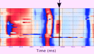
| Velocity and strain rate imaging of the same (normal) left ventricle. The colour sector can bee seen to be equal to the B-mode sector.Velocity is red in systole when all parts of the heart muscle moves toward the probe (apex) and blue in diastole. The changes are too quick to observe entirely, to make full use of the information the image has to be stopped and scrolled. | Curved anatomical M-mode (CAMM). A line is drawn from apex to base, and velocity data over time are sampled along the line and displayed in colour along a straight line. The numbers on the curve and the M-mode are included for reference and corresponds to the numbers on the B-mode image. This example shows the septum from the apex to base along one axis, and one heart cycle along the other, in a two - dimensional space - time plot. S: systole, E: early relaxation, A: atrail contraction. |
The information coded in the colour images, is
fundamentally numerical for all varieties of colour Doppler. Thus, the
velocity time traces can be extracted fom any point in the
image as shown below.
Extracted velocity curves from three points in the septum. As in colour flow, the M-mode gives the depth - time - direction information, while the curves give the quantitative information.
Thus: 2D images show the whole sector image at one point in time, velocity or strain (rate) traces shows the whole time sequence (f.i. a heart cycle) at one point in space, while CAMM shows the time sequence as well as the length of the line, but only semi quantitative motion / deformation information. |
 |
|
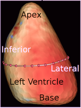
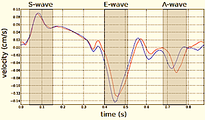
| As the apex is stationary, while the base moves toward the apex in systole, away from the apex in diastole, the ventricle has to show differential motion, between zero at the apex and maximum at the base. | As motion decreases from apex to base, velocities has to as well. This is seen very well in this plot of pwTissue Doppler recordings showing decreasing velocities toward apex. Thus, there is a velocity gradient from apex to base |
 |
 |
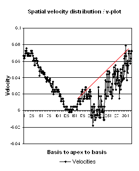
| Longitudinal velocity gradient, where v1 and v2 are two different velocities measured at points 1 and 2, and L the length of the segment between those points. | Spatial distribution of systolic velocities as extracted by autocorrelation. This kind of plot is caled a V-plot (247). It shows velocities as near straight lines, and thus, a constant velocity gradient, which is the slope of the curve from base to apex. . |

 is called the offset
distance or strain length.
is called the offset
distance or strain length.  |
 |
| The strain rate can be
described by the instantaneous velocity
gradient, in this case between two material
points, but divided by the instantaneous
distance between them. In this description, it
is the relation to the instantaneous length,
that is the clue to the Eulerian reference. |
train rate is calculated as
the velocity gradient between two spatial
points. As there is deformation, new material
points will move into the two spatial points at
each point in time. Thus, the strain that
results from integrating the velocity gradient,
is the Eulerian strain. In
this view, the relation to the spatial, rather
than material reference is very evident. |


 or
or  respectively, the velocity gradient /
strain rate can be calculated as the slope of the regression
line of all velocities along the offset distance as
described originally (14).
With perfect data, the values will be identical, both
formulas defining the slope. With imperfect data, this
method will tend to make the method less sensitive to errors
in velocity measurements, as the value is an average of more
measurements.
respectively, the velocity gradient /
strain rate can be calculated as the slope of the regression
line of all velocities along the offset distance as
described originally (14).
With perfect data, the values will be identical, both
formulas defining the slope. With imperfect data, this
method will tend to make the method less sensitive to errors
in velocity measurements, as the value is an average of more
measurements. 
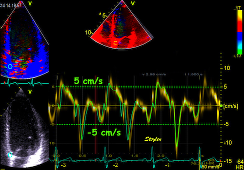 |
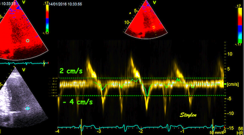
| Recordings from basal
septal mitral ring in a subject without
substantial clutter. Spectral Doppler shows the
dispersion of velocities, although this is
probably an effect of bandwidth.
The colour Doppler recording is superposed and
aligned with both vertical and horizontal scale.
In this instance can be seen to give values
close to the middle of the spectrum (modal
velocity). |


 |
 |
| Image from another subject in the study shown above (266). In this subjech there is some clutter from reverberations, as seen by the band in systole close to the zero line. In this case the peak velocity by autocorrelation is lower than the modal velocity of the main spectral band, which still was the one closest to the RF M-mode reference. (Figure courtesy of Svein Arne Aase, modified from (266)) | Clutter filtering
may reduce the problem, as seen here. There
is a band of clutter close to zero
velocities, but as seen here, the spectral
modality makes it very easy to separate the
true and clutter velocities. However, the
clutter affects the autocorrelation velocity
(red line), giving lower velocities, but
with clutter filter this effect is removed
(red line) , and the peak value is
substantially higher. Image modified from (268). |
 |
 |
| Shadowy reverberations covering the anterior wall in this 2-chamber image. It is differentiated from drop out, as we can se a "fog" of structures covering the anterior wall. The structures are stationary. On the other hand, this is not distinct reverberations shadows, but incoherent clutter. | Recordings from the basal anterior ring in a subject with substantial clutter. The tyrue signal is clearly visible as a normal curve, and can be seen separately from the clutter band, which is the horizontal spectral band along the baseline. The colour Doppler recording is superposed and aligned with both vertical and horizontal scale. The colour Doppler, using the autocorrelation algorithm, results in mean velocities that incorporate both signal and clutter, giving a severe underestimation of velocities. |
 |
 |
 |
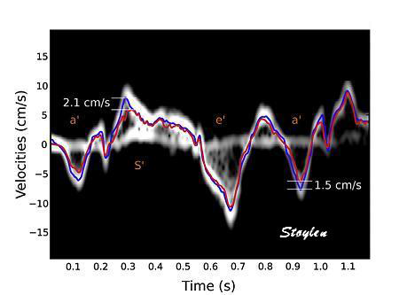
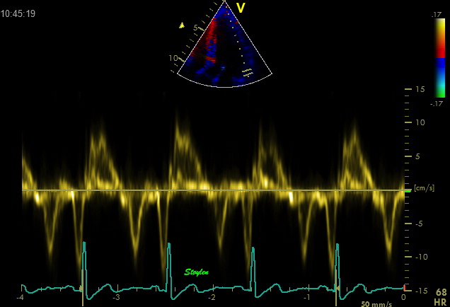
| Basal spectral tissue
Doppler curve in the anterior wall. Peak
systolic velocity ca 8.5 cm/s. |
Midwall spectral tissue
Doppler curve in the anterior wall. Peak
systolic velocity ca 6.5 cm/s. |
Apcal spectral tissue
Doppler curve in the anterior wall. Peak
systolic velocity ca 5 cm/s. |
 |
 |
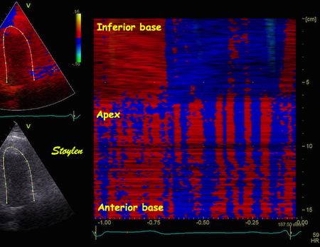
| IColour M-mode from the
image shown above. The curved M-mode shows a
fairly homogenous and normal signal in the
inferior wall (top), but more or less random
noise in the anterior wall (bottom), where
the noise is seen as vertical stripes of
alternating colours. |
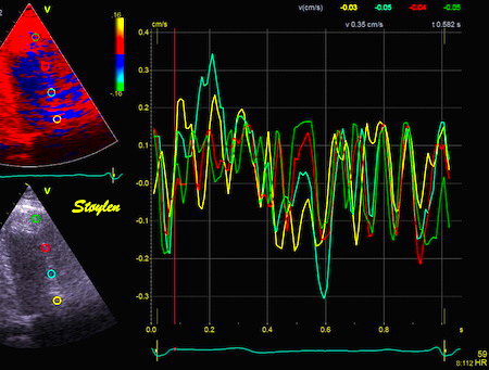
Velocity curves from
the anterior wall, showing noise, and not
much more, but at low level (within ± 0.3
cm/s). |
 |
|
| The principle of the effect of clutter. V-plot with clutter showing how the mean velocities are reduced, compared to the mormal expected values (red line). But in additions the variation of the velocity estimates from pixel to pixel is much higher, resulting in increased noise, but with reduced mean values. | Combined pulsed Doppler
(yellow bands) and colour Doppler green
Aligned horizontally and vertically. The
noise level can be seen to be b´very low,
compared to the peak velocities shown in the
pulsed Doppler recording. The clutter is the
horizontal band around the baseline, and the
width of the spectrum in this case is the
noise. |
Ultra high frame rate tissue Doppler is done by combining more principles:
By this method, using two broad, unfocussed (planar) beams,
each covering one wall, as well as 16 MLA and sparse
interleaved B-mode imaging, it has proved possible to
increase the TDI frame rate substatially (172, 268). it has been
possible to increase frame rate to 1200 FPS in 2D
imaging.
Few beams give
high frame rate. Image
courtesy of Svein Arne Aase, modified from
(172).
Already this has shown new information about both the
pre
ejection and post
ejection dynamics.
With this method, it is possible to acquire IQ (RF)
data with FR > 1000. This makes it possible to
process restrospective tissue Doppler from the whole
field (i.e. that covered by the two transmit beams),
simultaneously from one heart cycle. as in colour
Doppler.
Tissue Doppler is still limited to one velocity
direction only. This means that the term
"3-dimensional" refers to a three dimensional distribution
of tissue velocities only, not velocity vectors
in a three dimensional coordinate system. However,
data from the whole ventricle can be put together on a
surface model of the left ventricle.
 |
 |
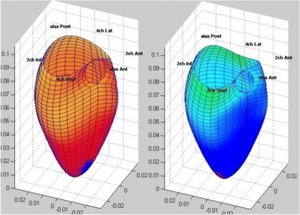
| 3D tissue Doppler is
basically a grid of numerical values on
a ventrricular surface. |
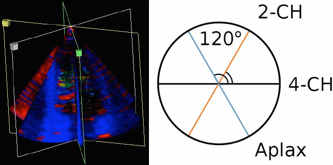
Triplane tissue
Doppler, showing three standard planes, with
the assumption that the angle between them
is 60°, the rest of the data between the
planes are than interpolated. This gives a
circumferential resolution of 60°. |
As tissue data as about acquiring (and displaying,
f.i. by colour) numerical data, the method do not have
the same limitation as 3D B-mode. One method is to
combine information from three standard planes, and
then interpolating the data between the planes by for
instance spline. The method has been explained elsewhere.
This has been done both by combining sequentially
acquired standard planes. It could also be done as a
simultaneous triplane acquisition, but at the cost of
a substantially reduced frame rate. Thus, freehand
scanning has been preferred.
This version of three dimensional tissue Doppler may
be used for display, but also for area measurement, as
the data are distributed over a representation of the
(approximate) real ventricular area.
With the Ultra
high frame rate tissue Doppler method, it is
also possible to acquire three dimensional tissue
Doppler in real time.
Using a 3D matrix probe, sending an array of 3x3
broad unfocussed or planar beams, and using a 4x4
matrix of receive beams for each transmit beam, giving
a 16 (or 4x4) MLA, we have been able to achieve a
volume rate of about 500 VPS (280),
i.e. Ultra high frame rate 3D tissue Doppler.
 |
 |
 |
| Principle of beam
formation, showing a matrix of 3x3
wide transmit beams (brown circles) and
for each beam an array of 4x4 receive beams,
i.e. a 16 MLA. (After 280). |
Distribution of the
transmit beams in relation to a cross
section of the ventricle, endocardial
and epicardial surfaces marked with black
lines and arrows. the energu distribution of
the beams is shown by the colour hue. The
transverse plane shown to the right is
marked by the thick line. (After 280).
|
Distribution of the transmit beams in an apical plane, the level of the cross section to the left is marked by the thick line. As evident from the illustration, the transmit beams do not cover the whole sector, but will cover most of the walls. (After 280). |
By this method, t is possible to achieve a high
circumferential resolution through the MLA technique
at the same time as a high temporal resolution. The
result can be displaued as a 3D figure, as with
reconstructed 3D, and both curved M-modes and
tivelocity curves can be extracted from this matrix:
 |
 |
 |
|
| 3D surface with tissue velocity display. The ring represents a line for extraction of the curved M-mode shown top, left. (After 280). | Data display from the
3D velocity figure to the right. Top: curved
M-mode, showing the time variation of
apically directed velocities in a ring
around the mid
ventricle. Bottom,
velocity curves from the basolateral part,
red from UFR 3D TVI, extracted from the 3D
data to the left, blue velocity from the
same point in the same subject, but acquired
bt conventional colur TDI (i.e. a different
heartbeat). |
 |
 |
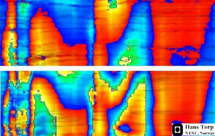
| Colour M-mode
(CAMM) of tissue velocities in fundamental
(above) and harmonic (below) imaging. Slight
aliasing can be seen in native imaging in the e' wave at the base. In harmonic imaging, there is aliasing both in the S' wave, and the e' wave (double). |
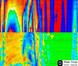
Colour tissue
Doppler curved M-mode in harmonic imaging,
velocity plot (above), strain rate (below).
As can be seen there is heavy aliasing in
the velocity plot, but no aliasing in strain rate imaging. |
![]()
Editor:
Asbjorn Støylen, Contact address:
asbjorn.stoylen@ntnu.no